Two Beautiful Bibles
Having been a Christian for years, I own several Bibles. I appreciate that this is a luxury uncommon in the history of the faith; for a long time, it was rare to own a single Bible, and for longer than that it was rare to access to Scripture aside from hearing it read aloud. And there are still places on earth where owning a Bible can get you thrown in jail or worse.
Some of the Bibles I own serve different purposes. I have a single-column Bible that I like to use for day-to-day reading, since multiple columns makes it feel more like a book for reference and less like a book for reading. I own an ESV Study Bible replete with maps and charts and commentary that I use for digging into Scripture — less for reading than for studying.
And I own two Bibles for the sheer beauty of them.
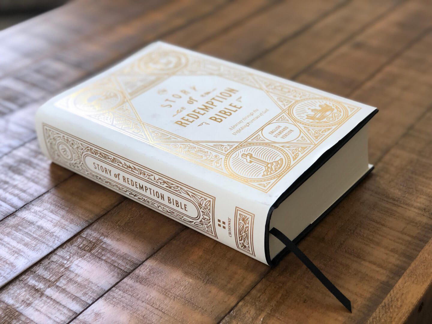
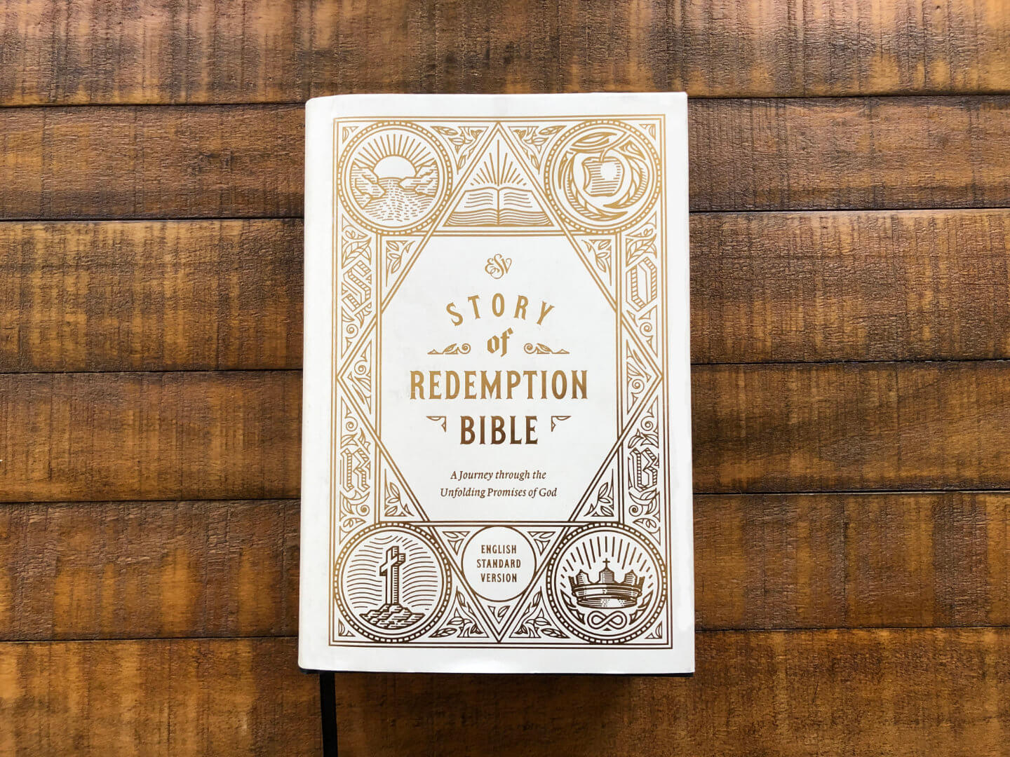
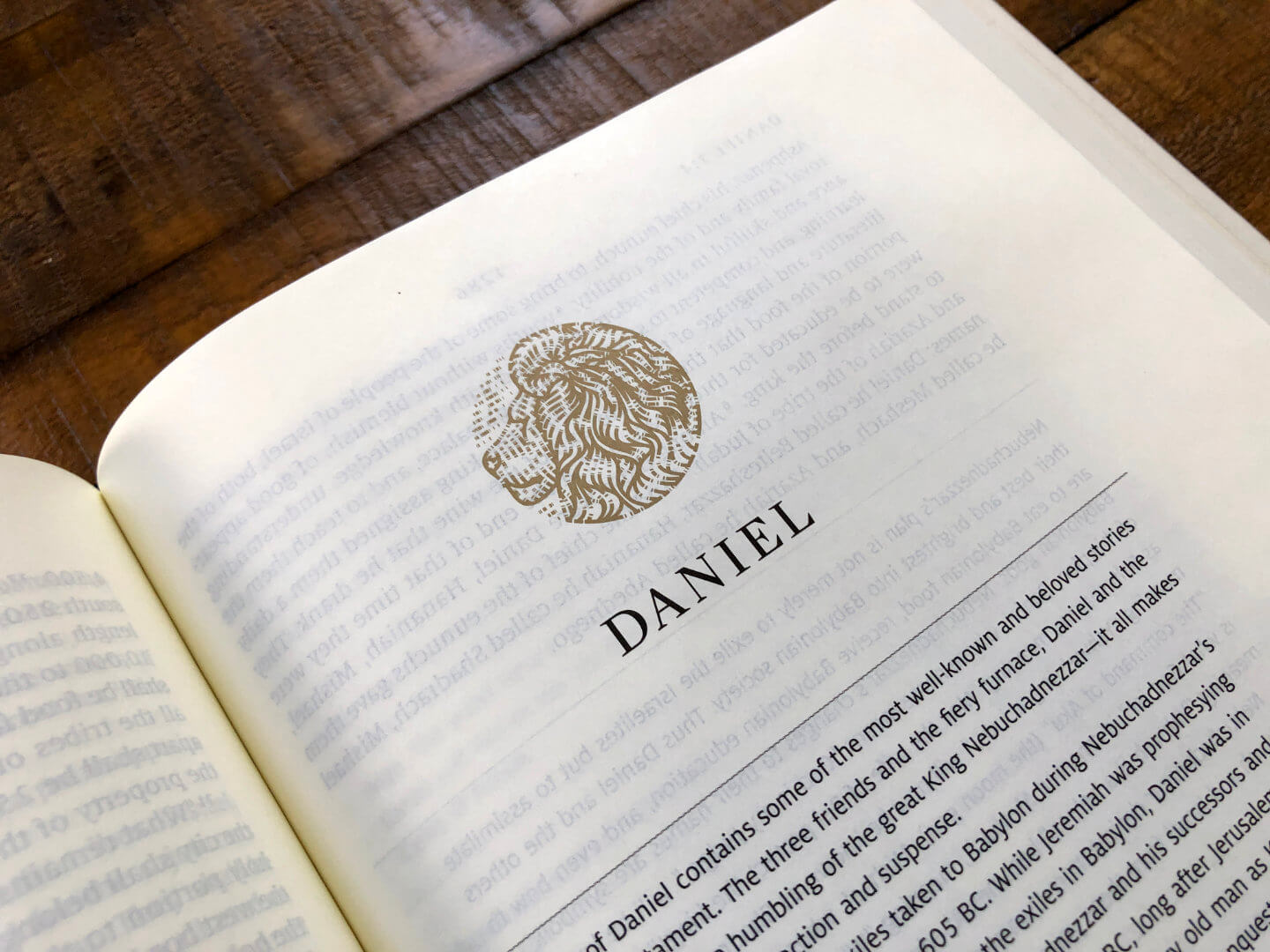
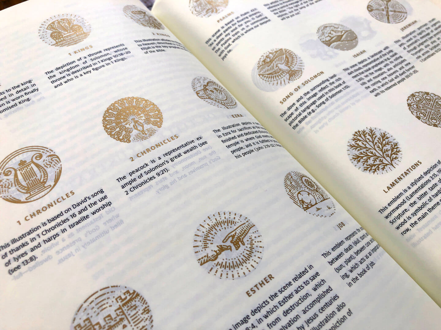
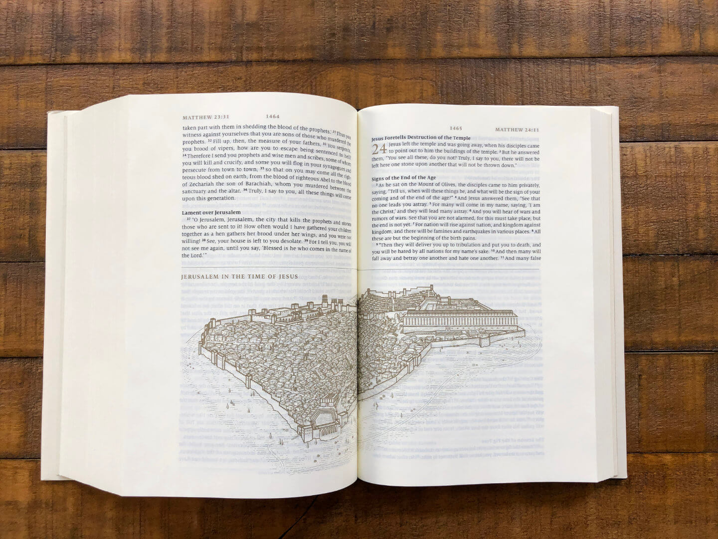
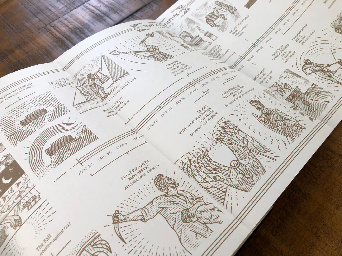
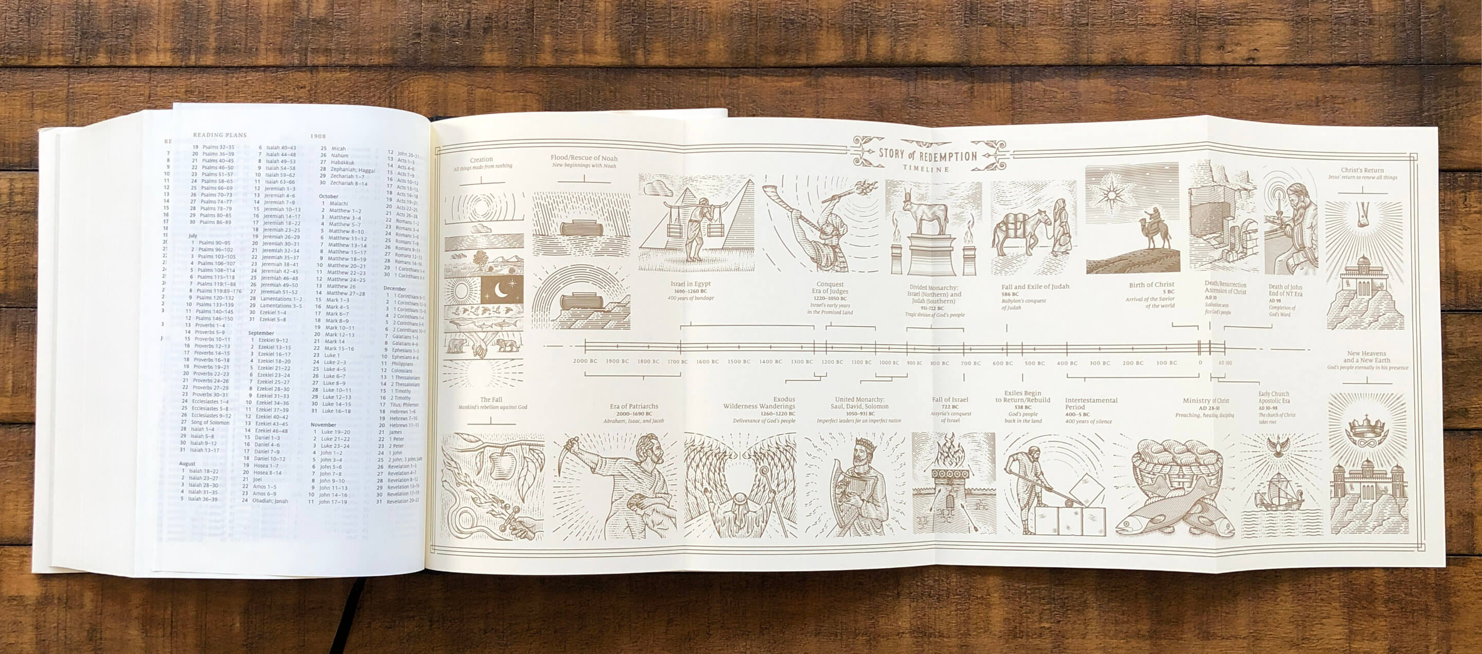
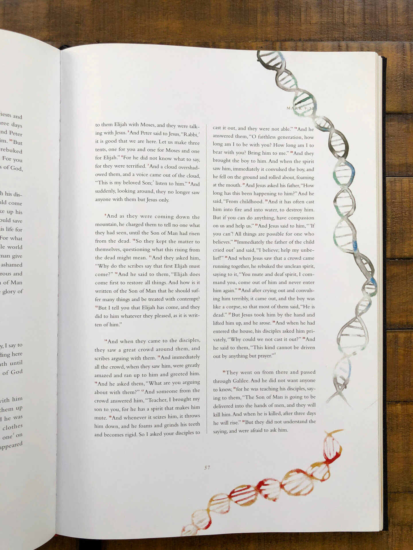
The one that inspired me to write this post I got just the other day: The Story of Redemption Bible, illustrated by Peter Voth. I know Peter’s work from Dribbble, and when I saw his illustrations, I knew I had to own a copy. It’s got lovely gold accents, friendly and readable typography, and illustrations that look like etchings.
On one of his Dribbble posts, Peter mentions that the design team wanted it to feel like a single-volume Lord of the Rings. Between the fold-out chronology in the back, and the illustrated pendants that head each book, I think they hit their mark.
The second Bible isn’t really a Bible at all — it’s an anthology of the four Gospels. It’s illuminated by Makoto Fujimura, one of my favorite artists. He’s an abstract expressionist, and he’s known for incorporating ground-up gemstones into his work to give it a luminescent quality.
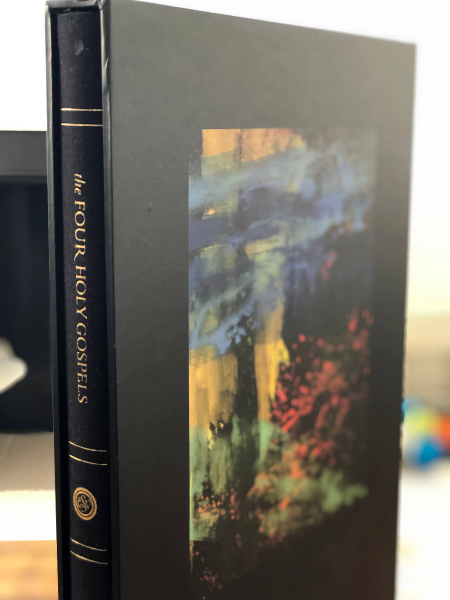
Because of how large the Fujimura book is, it’s not really for reading — it’s more to keep at a lectern, or (in my case) to keep near my desk to look at and smile occasionally.
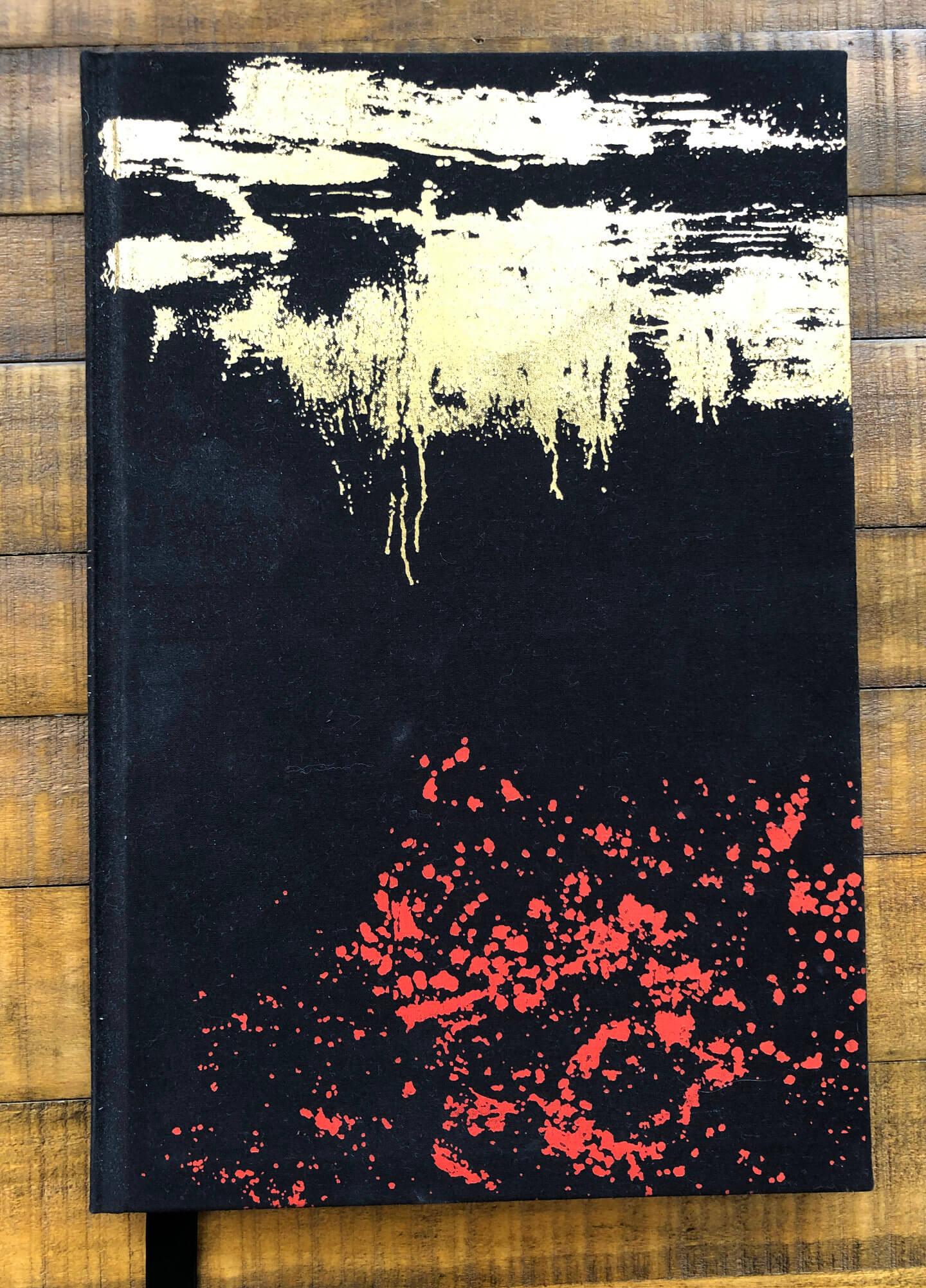
I had the chance to see his Four Gospels frontispieces in-person at the Dillon Gallery in New York City; they were massive, and because of the materials he uses, they look different from different angles. I love this Bible, but unfortunately a print can’t capture the feeling of the originals.
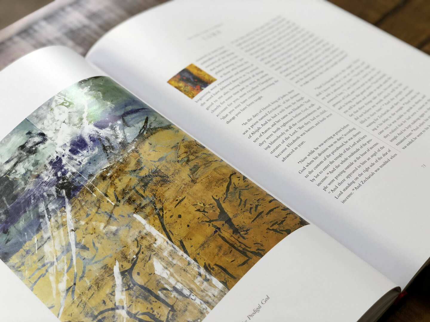
The text is illuminated by illustrations painted directly onto the Scripture by Fujimura.
The Scriptures make it clear that God cares about beauty; as creatures made in His image, we’re wired to care about it too. The Church hasn’t always made aesthetics a priority — we’re not in the era of cathedrals and Michaelangelo and Bach anymore — but it’s heartening to see projects like these that pursue excellence in the presentation of God’s Word.