Spoke
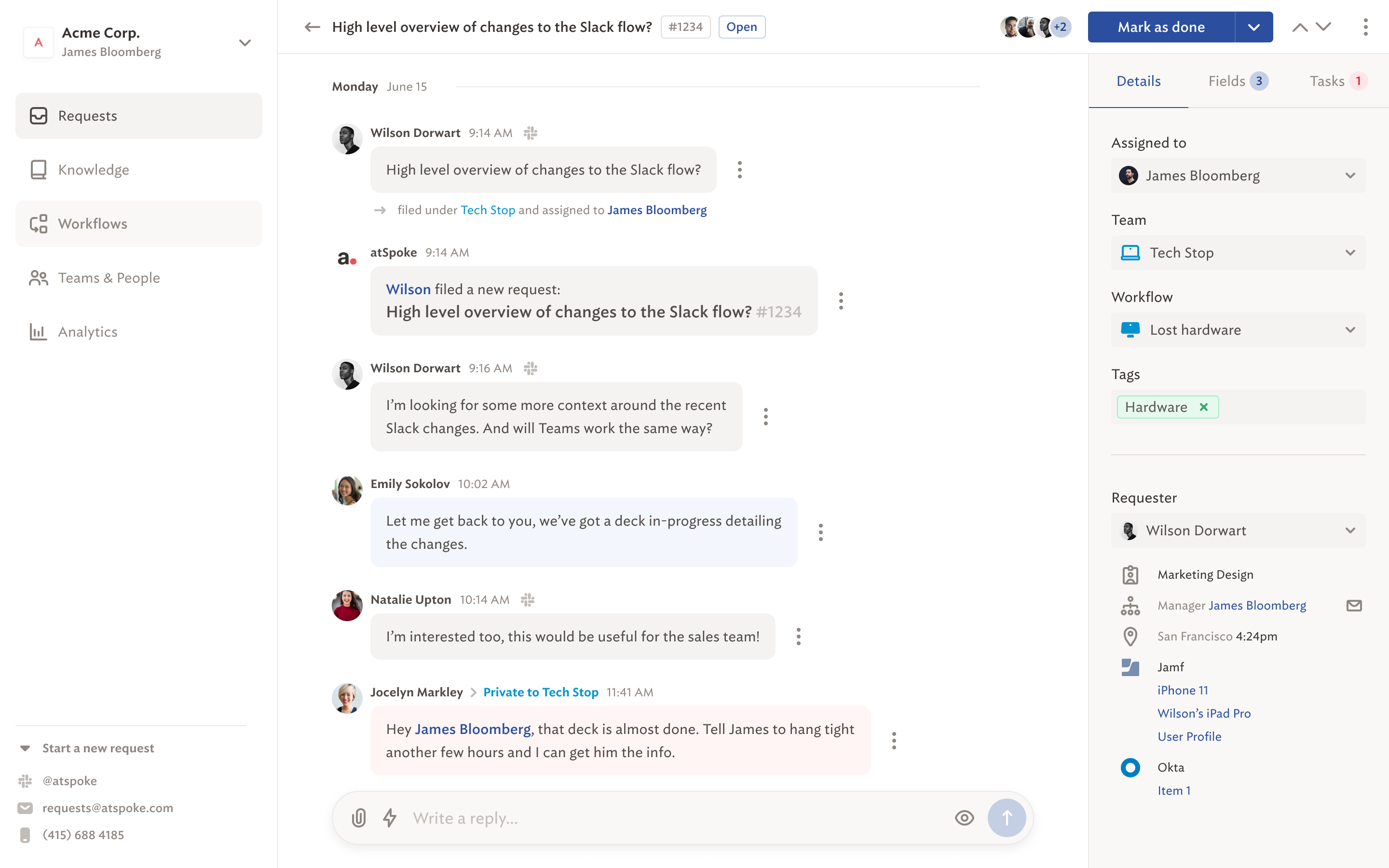
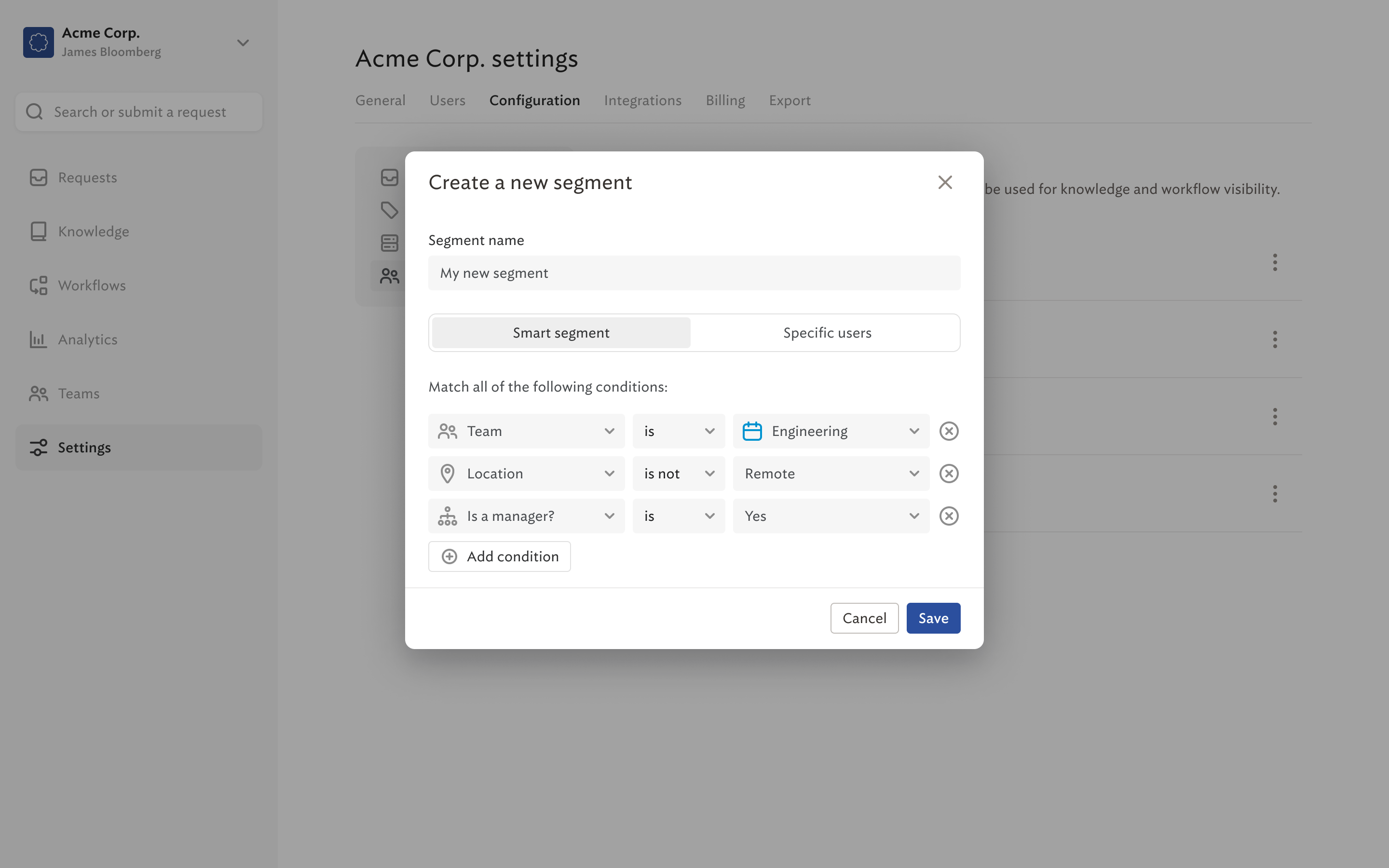
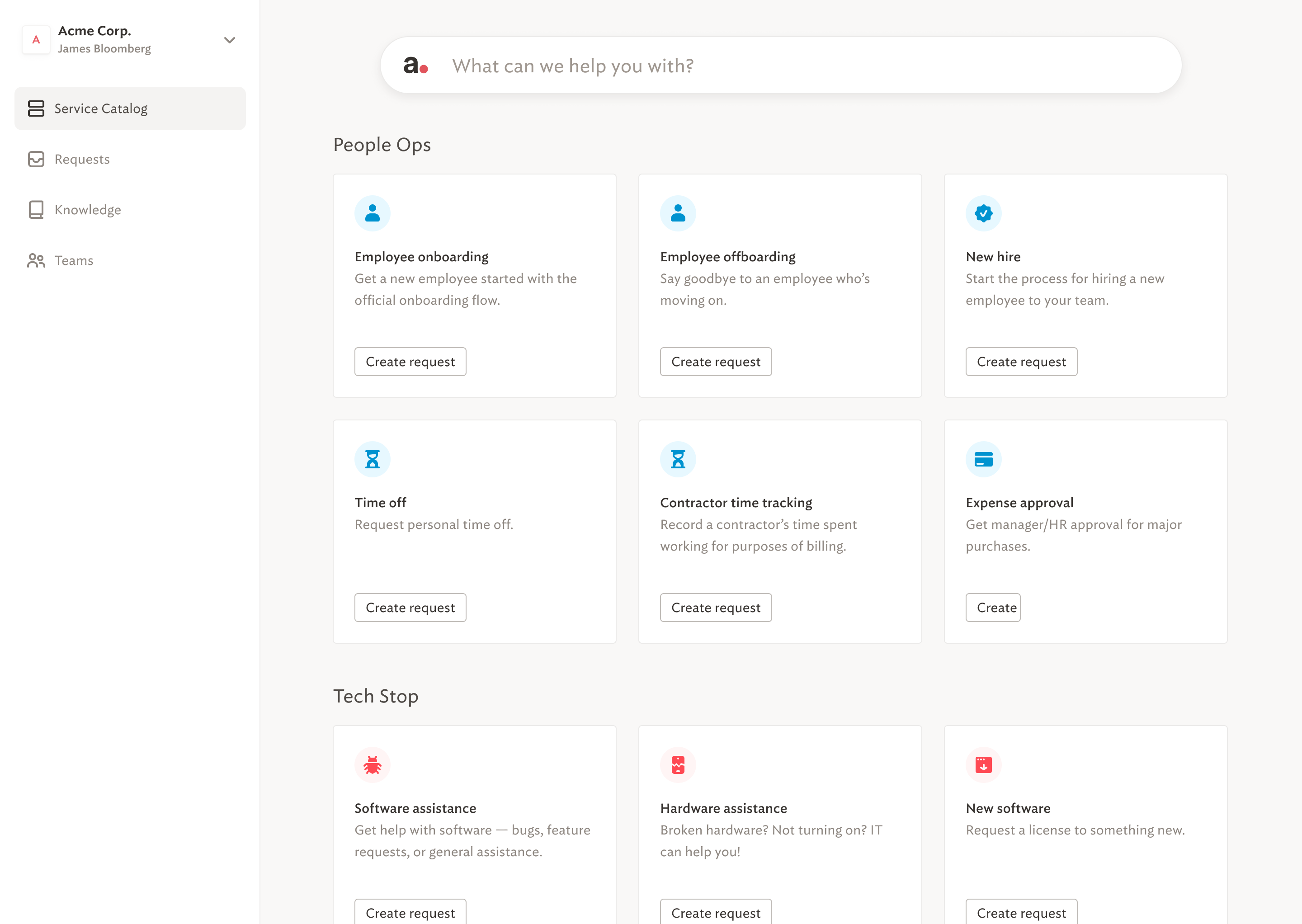
Spoke was a magical B2B product that used machine learning to automatically answer employee questions in Slack, MS Teams, or our own bespoke web platform. It would find existing answers in the company’s knowledgebase, or triage requests to the most relevant employees based on their availability and area of expertise.
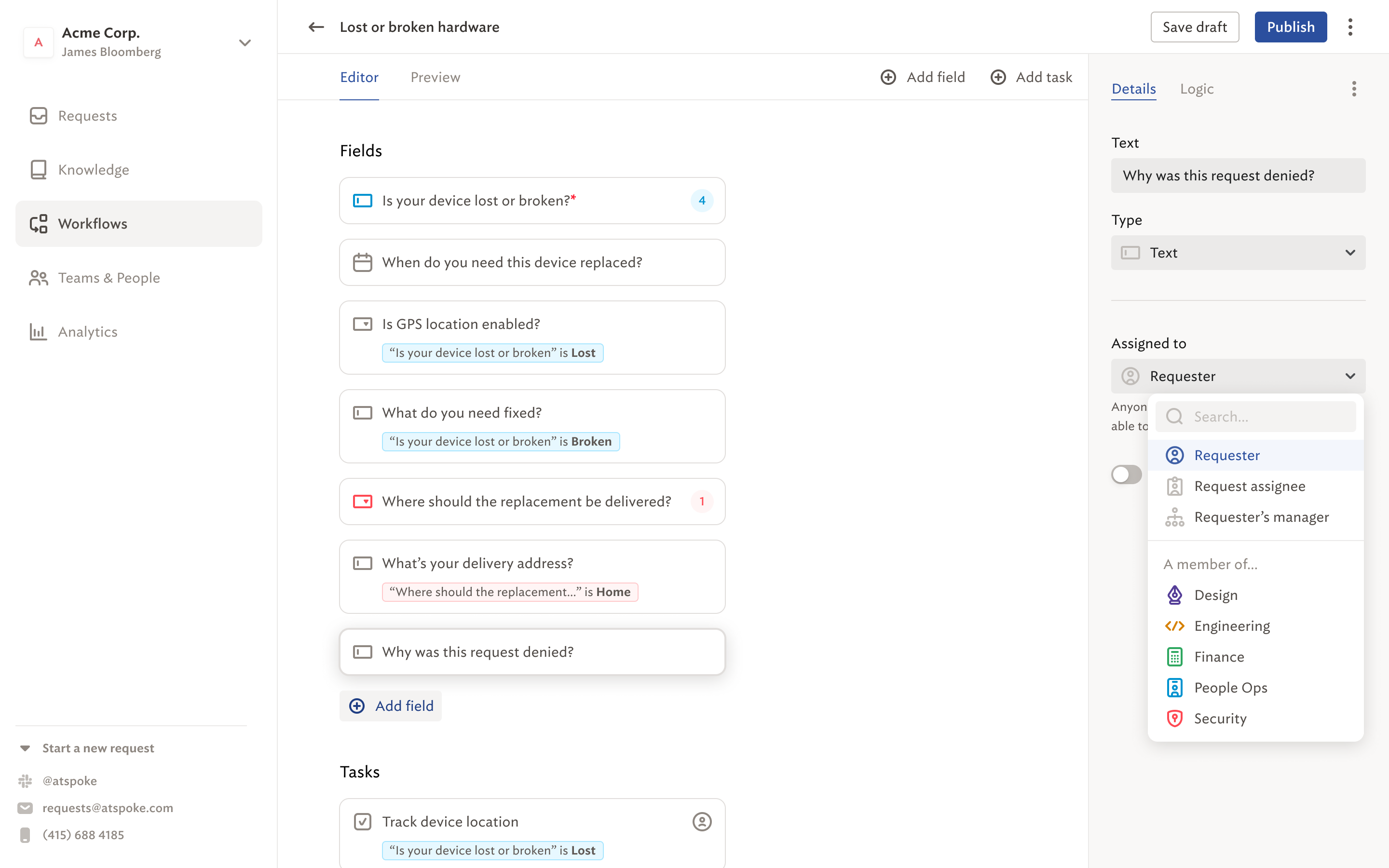
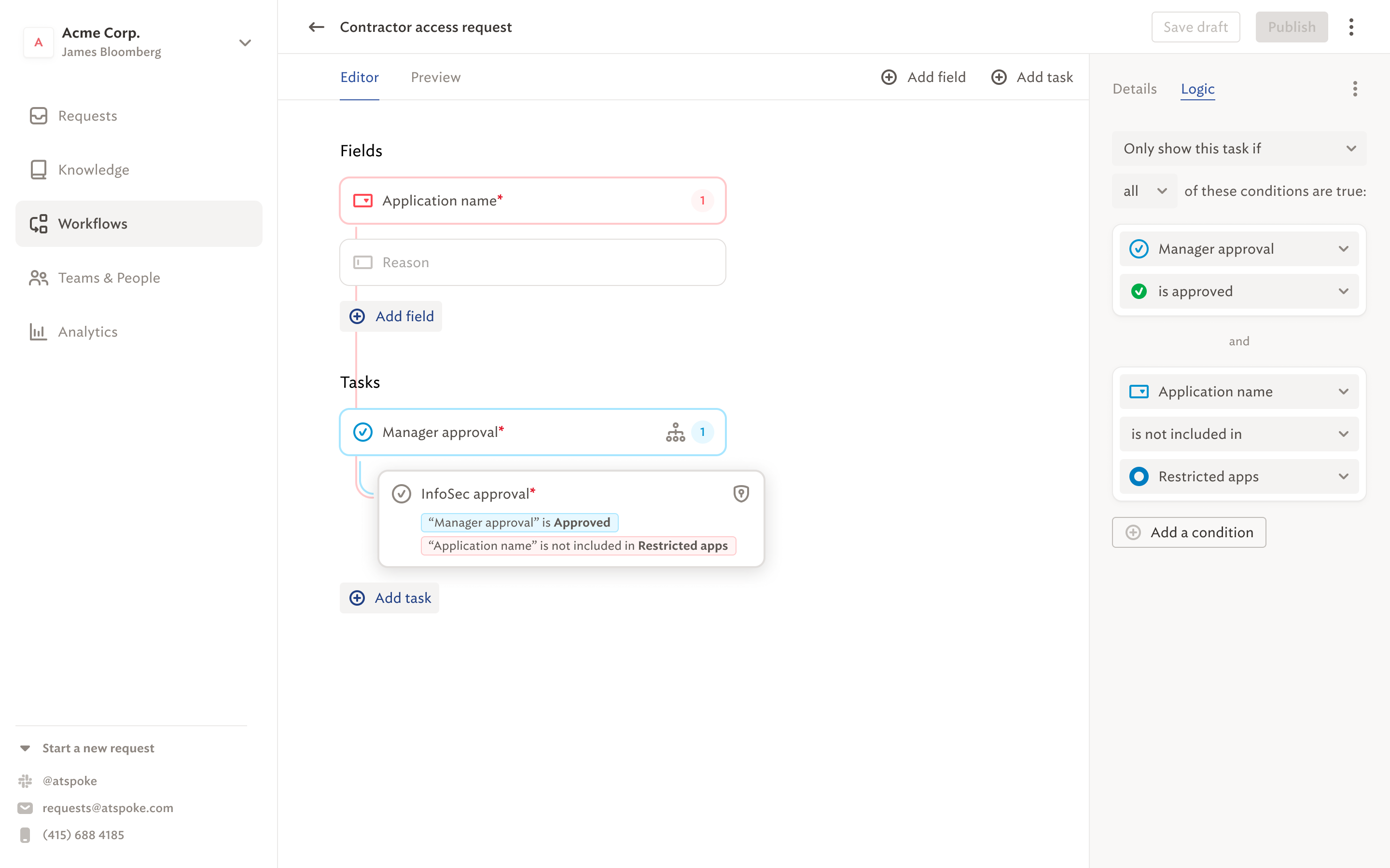
I led design prior to Spoke’s acquisition by Okta in 2021, managing a tiny team of one other product designer and one marketing designer, while also doing my own product design work. I designed our Workflow Automations tool, which enabled admins to construct rich human-in-the-loop automations using a drag-and-drop interface. (Think Zapier or IFTTT, but for enterprise workflows that could be triggered via natural language commands in Slack).
Design Principles
One of the three Spoke founders was a product designer, and the company had design baked into its DNA from the start. During my tenure as design lead, I kept us aligned to the following principles:
- Meet users where they are. Users should be able to engage Spoke without switching contexts — that means supporting Slack, MS Teams, email, SMS, the web… anywhere users are, we are.
- Human-in-the-loop. Use ML as much as possible, but always provide a way for a human to intervene. A live person should always be able to countermand Spoke’s best guess, and that change can become a datapoint to enable Spoke to guess better the next time.
- Leverage existing patterns. Keep the UX as consistent as possible so the user feels comfortable across features. Familiarity beats originality.
- As little design as possible. Avoid adding new things whenever possible. If we must add something to the product, endeavor to make it transparent to the user. If it can’t be transparent, then make it simple and familiar.
- Smart defaults > infinite settings. Have strong opinions based on our experitse, rather than burying the user in options. Providing too much customization is lazy design — it offloads our decision-making responsibilities to the people we serve.
- Don’t be clever. Prefer the obvious path to the clever path. A good product gives the user superpowers without drawing too much attention to itself. It’s better to leave the user thinking, “Hey, I’m awesome” than “Hey, Spoke’s awesome.”
