Dwell
I was senior designer/developer at Dwell, an audio Bible app for iOS and Android.
I was the sole designer, as well as a member of the three-person engineering team. I worked in HTML and CSS (by way of HAML and Sass), JavaScript, Ruby on Rails, and Swift. My code spans both the web and native iOS sides of the project.
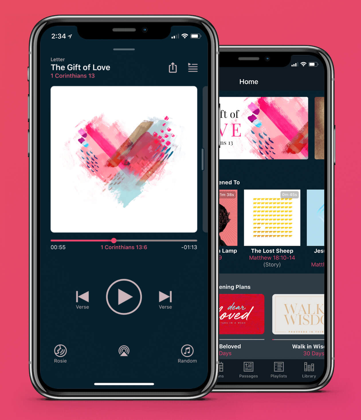
The Dwell Story
I’ve been looking for a good audio Bible for years. Once, I thought I’d found one — it featured James Earl Jones reading the entire Bible, which sounds perfect, except that when I tried the sample I realized it had terrible MIDI renditions of 90s worship music in the background. Strike out.
Dwell is different. Started as a Kickstarter project, its focus is on being excellent. It features four newly-recorded voices, each with a different accent and personality. It has five original albums of music from a renowned composer, each in a different genre and each composed just for Dwell. And it has the ability to change the volume of voices and music separately, so you can create a mix that works for you.
The Bible isn’t conducive to being an audiobook. Unlike most books, it isn’t designed to be read straight-through — most readers jump around, preferring to experience the Bible thematically, chronologically, or in smaller pieces.
Dwell leans into that. As the first audio-focused Bible app for iOS, it makes use of the interaction paradigms of the medium; it feels more like Spotify or Apple Music than an audio Bible. Users can listen to complete books of the Bible, or they can listen to discrete passages and stories, thematic playlists, or day-by-day listening plans.
It’s clearly an idea that resonated; it became the fourth most highly-funded app ever on Kicksarter, raising over $128,000 — 250% higher than the goal of $50k.
I joined the team in April 2018 as the first dedicated designer. The previous design work had been done by the founders, but as it came time to start building the actual product they wanted to bring a specialist onboard to translate the concept and spirit of Dwell into an actual, tangible product.
The Dwell Website
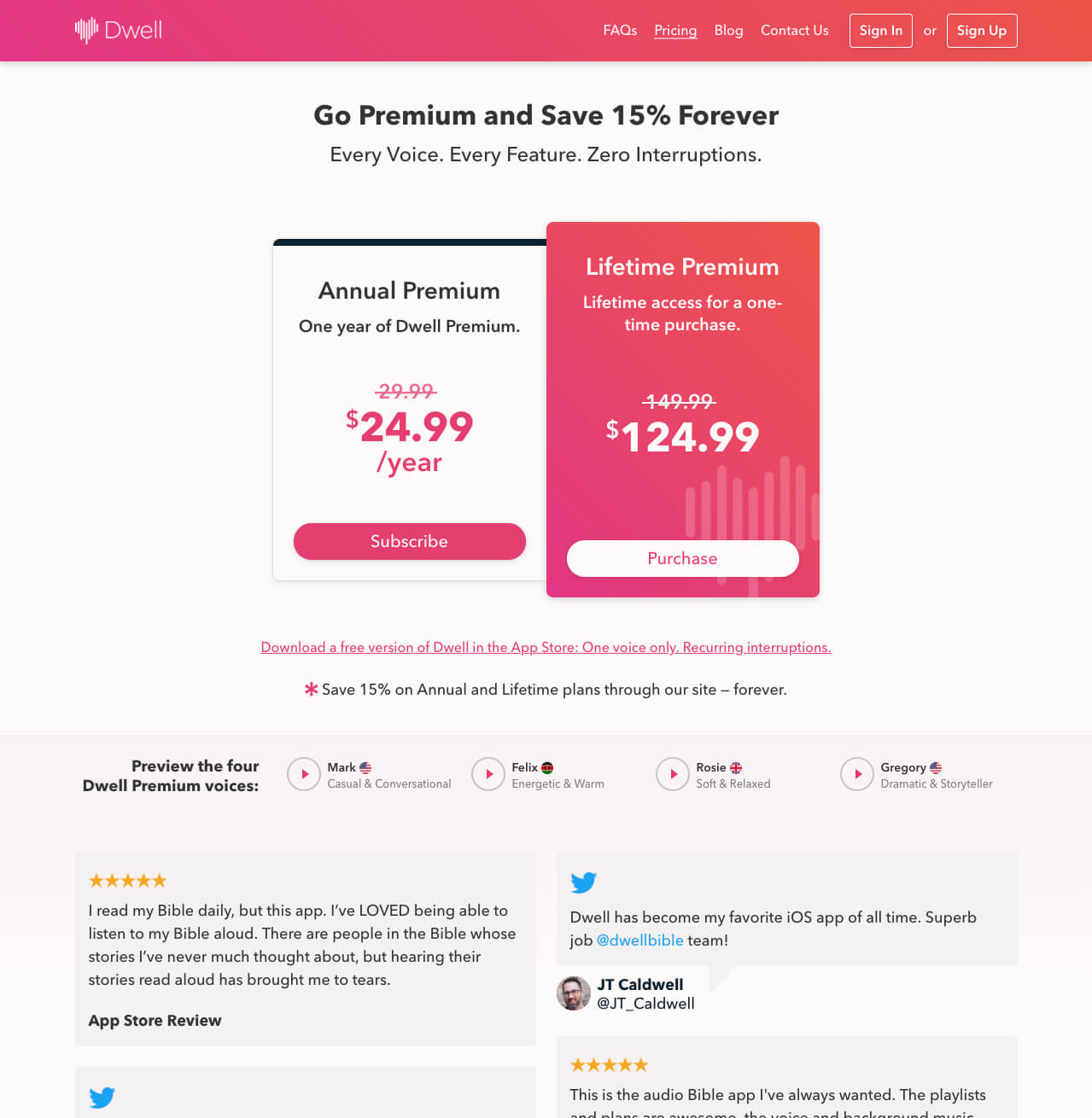
I redesigned the Dwell website to make use of the gorgeous color palette and brand created for us by brand designer Joshua Krohn.
The website uses big gradients and strong imagery to showcase the app and its features, as well as the original artwork found on each plan, playlist, and package. I’m particularly fond of the footer, which uses one of Dwell’s press images to add life to what would otherwise be pure negative space.

The gradient repeats throughout the site, including in the header and on the highlighted plan on the Pricing page:
The Dwell App
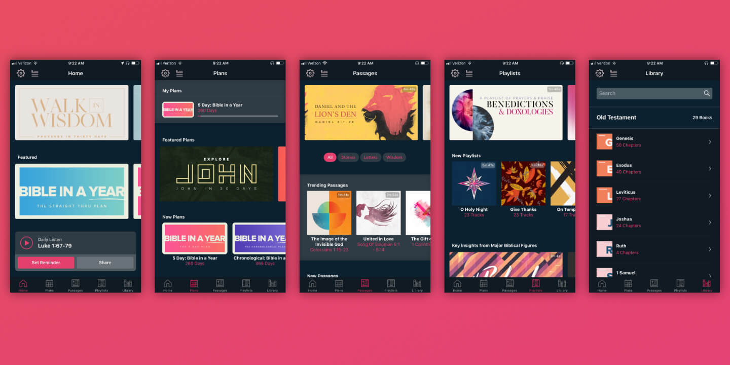
The app centers around two user behaviors: Discovery, in which a user finds what they want to listen to; and Listening, in which a user experiences the content.
Discovery happens in the app’s various screens:
- Home, a personalized home page with featured content and recent listens
- Plans, where the user can find and join daily listening plans
- Passages, which features notable stories and sections of the Bible
- Playlists, consisting of themed groupings of verses
- Library, where the user can find whole books and chapters of the Bible
As in most audio apps, Listening happens in a dedicated player. I recently led a redesign of the player, and wrote much of the presentation code in Swift.
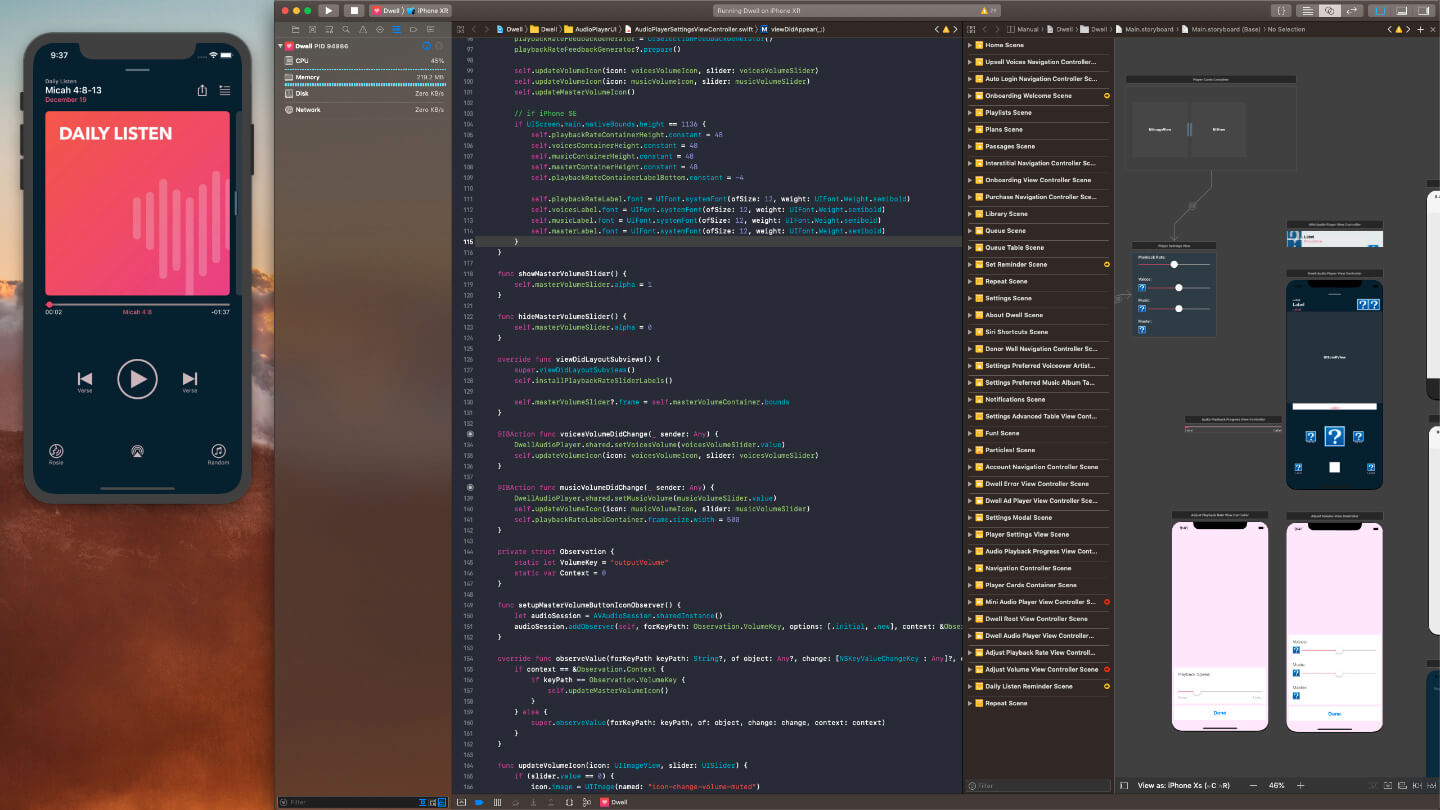
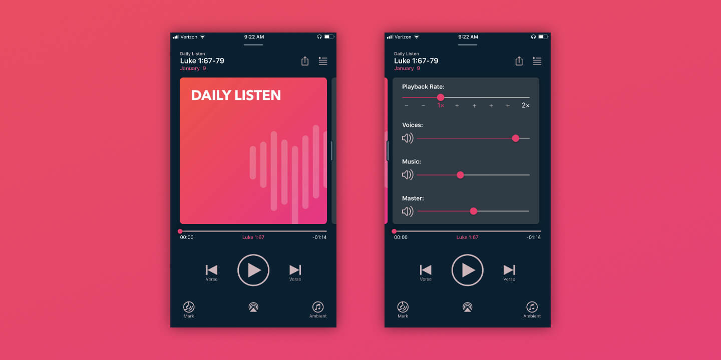
Previously, player settings were accessed via buttons on the player’s main screen. As we added more features, this started to look cluttered — something we really didn’t want for the place where our users spend the most time.
We moved all the playback settings to a separate view, accessible by swiping the album art to the side. This declutters the main player view, allowing the focus to remain on the content, and also enabled us to group the volume and playback rate sliders in a more logical manner.
Designing for Accessibility
One of my priorities was to make Dwell accessible to anyone — particularly those with vision impairments who experience Scripture primarily through audio.
On the web side, I was been able to use ARIA elements to make the Dwell website work well with screen readers and other accessibility devices.
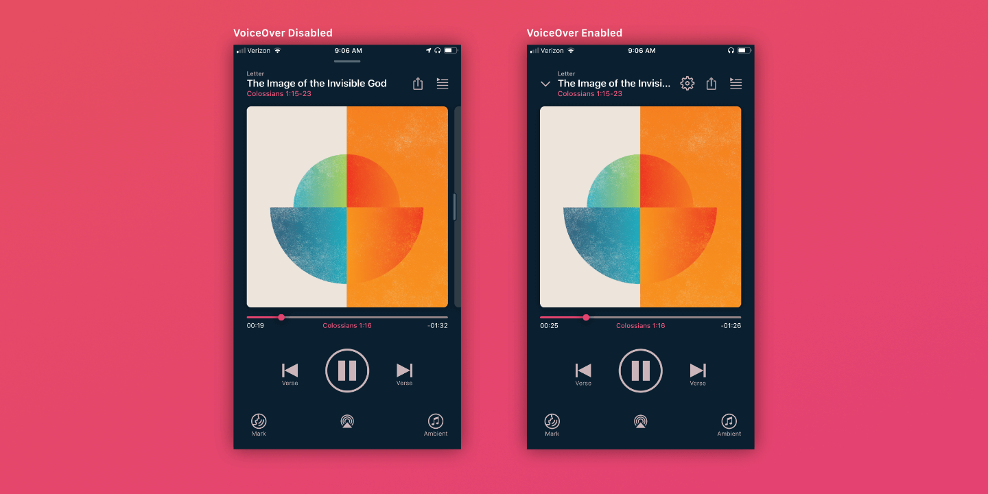
In the app, we spent a lot of time working with dynamic type sizes, testing it with VoiceOver, and ensuring that it works well for all our users. One particular example of designing for accessibility is the player. Some of the default player functionality assumes the user is able to swipe:
- To dismiss the player, the user swipes down
- To access player settings, the user swipes the album art to the left
When VoiceOver is active, however, we make those actions explicit by exposing buttons for Dismiss and Settings. This ensures those behaviors show up in the tab order properly, making it easier to use with the screen reader.
The whole Dwell team has been dedicated to creating an app that treats everyone as a first-class citizen.
Launch and Beyond
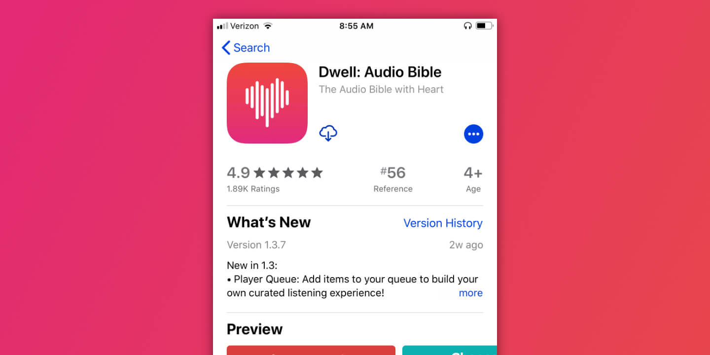
Dwell is live in the App Store and is being used by thousands of people to experience Scripture in a new way. With 4.9 stars and almost 2,000 ratings, it’s clearly resonating with its audience.
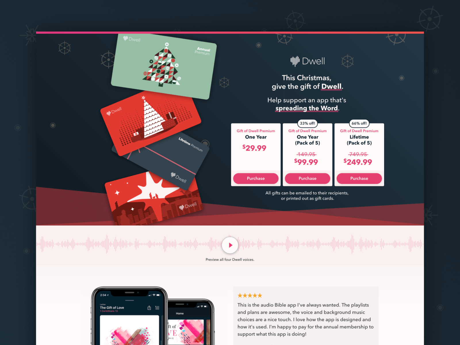
I had the opportunity to create landing pages to advertise Dwell promotions, iterating on each one to create a stronger selling proposition and better serve our goals.
After launch, I helped add new features, tightened up what already exists, and used user feedback to check our assumptions and guide the next phase of development. The next year brought a honed and refined Dwell to an ever-growing audience as we improved the iOS version and introduced an Android version.
You can see Dwell for yourself here.