Agrilyst
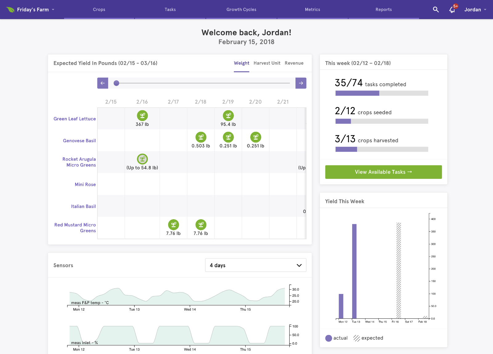
Agrilyst is the intelligence platform for indoor farms — we help growers understand their data, manage their facilities, and work more efficiently thanks to data-rich insights. In addition to being a well-known presence in the Brooklyn startup world, Agrilyst won TechCrunch Disrupt SF in 2015.
I joined Agrilyst in 2016 as its first Lead Product Designer. At that point, it already had the beginnings of a design language, created by an outside design firm — my job was to evolve and extend that language while ensuring that it was implemented consistently. My role quickly expanded to include some front-end engineering, and I spend much of my time working in HTML, CSS, Rails, and React.
A Growing Product
As happens with many early-stage products, the feature set we originally planned for grew and morphed into something different as we learned which features were most exciting to our customers. As the product vision expanded, the initial interface started showing signs of wear: it could only handle so much outside of its original scope before it became obvious it would have to evolve into something bigger.
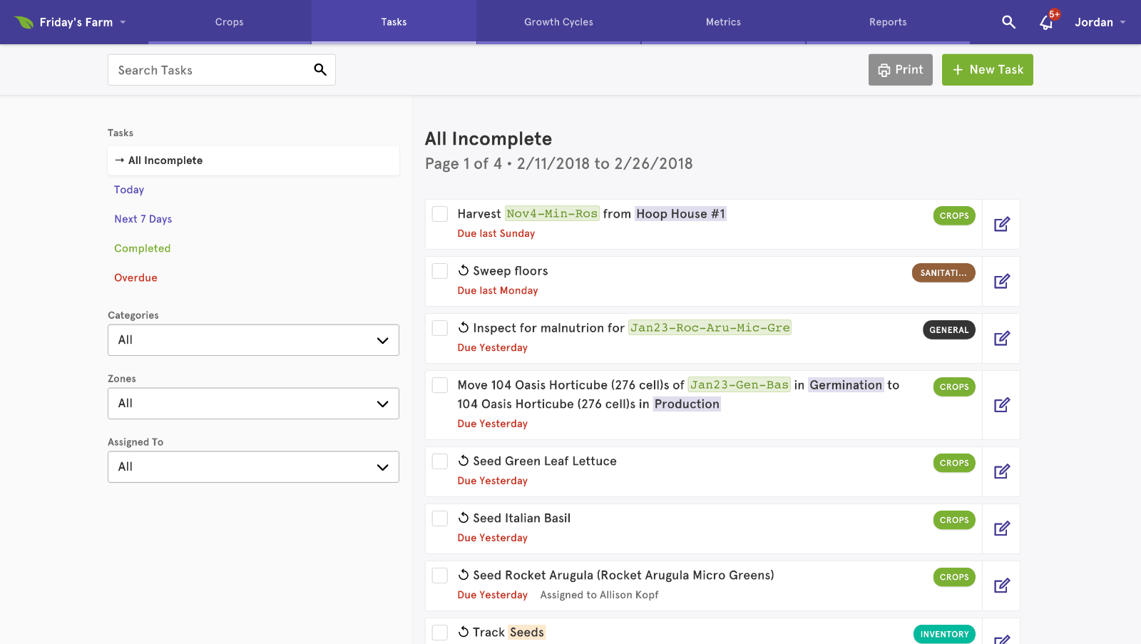
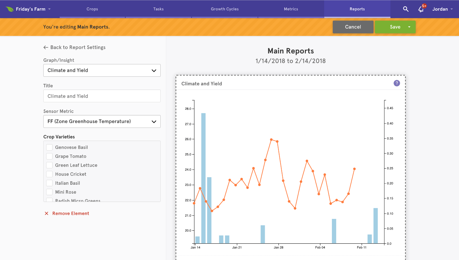
I iterated on the initial design to fit in new features. This included:
- Adapting the existing layout to accommodate new functions and features.
- Increasing the information density, so users could see and do more on each screen.
- Standardizing the layout between user tasks, so growers wouldn’t have to learn a new interface for each new feature.
- Improving contrast, to account for users working with the platform in sunny greenhouses on mobile devices.
Feature Example: Growth Cycles
In 2017, we introduced Growth Cycles: a drag-and-drop system for defining the lifecycle of a crop. Growers can specify each step a plant goes through from seed to harvest, including the timing, and Agrilyst will pre-populate their task list with what they have to do on each day.
This was a major paradigm shift for Agrilyst — previously, this was done via a simple form. To make the new system immediately understandable, we designed the interface to operate similarly to Scratch, a visual programming language developed by MIT to help people learn to code.
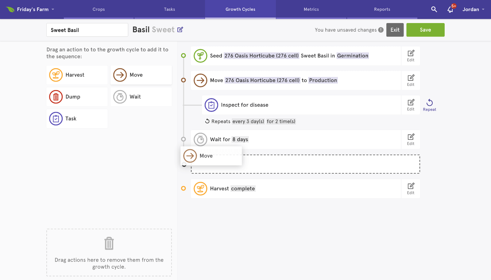
In addition to designing Growth Cycles, I helped implement it in React. Our engineering team handled the backend and lit up the React components, and I fleshed out those components into the layout that’s being used today.
Building the Front-End Framework
In 2017, we decided that Agrilyst needed a refresh of its front-end framework. Our expansion of features meant that there were silos of CSS that overlapped and repeated, and there were parts of the code that could be cleaned up and refactored. My goal was to reduce code bloat, speed up developer efficiency, and give us a stable foundation from which to build the future of the platform.
Initially, I was torn:
- We could go with my first instinct and use an object-oriented approach to CSS, probably using BEM naming conventions
- We could use a more utility-driven approach that favors discrete, composable classes. This approach has recently become popular again and has its advantages, but still feels strange to someone who’s old-hat at BEM.
Eventually, I decided on a hybrid approach: we have a library of utility classes that match our visual brand, allowing us to prototype and iterate quickly, directly in code. But we also have a library of objects and components, abstracted out of our frequently-used patterns. This gives us both the speed of the utility approach, and the stability of the object-oriented approach.
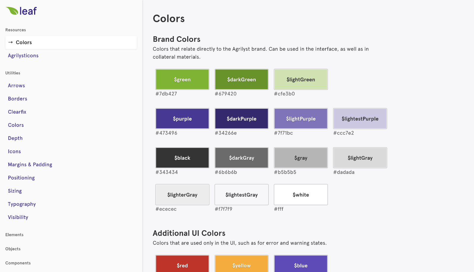
The resulting framework (“Leaf”) has been a success on all counts. The code is leaner, our naming conventions are predictable and consistent, and more values have been abstracted into Sass variables. Changes are quicker, since our file structure is now more logical, and we’ve eliminated most of our repeating code.
The Marketing Site
When I started at Agrilyst, the marketing website was a simple one-pager without much information. We decided to expand it, and we wanted to use a CMS so we wouldn’t need to tie up product team resources every time we needed to make a change.
I designed and built the new website as a custom WordPress theme, incorporating third-party services such as Calendly and Mailchimp to keep things working with our existing ecosystem of tools.
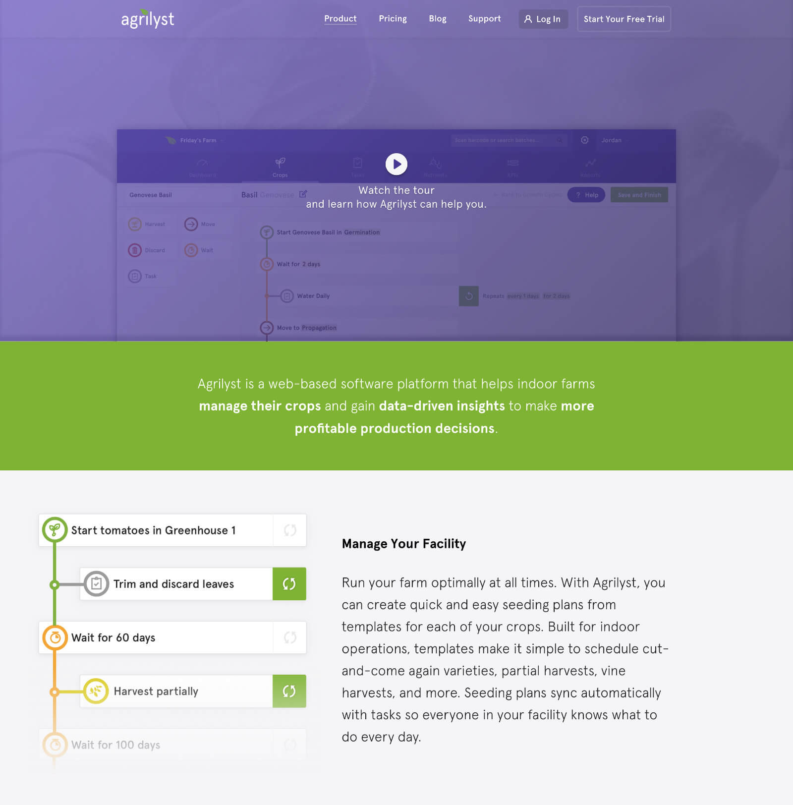
Behind-the-scenes, each page of the site is a collection of blocks that anyone can access. Need to include a video? Add a video block. Want to add some text with an image on the left? Add a text-with-image block, and choose the image-left layout.
The new website is more fleshed-out and robust than the previous iteration, not to mention prettier (if I do say so myself).
State of Indoor Farming Survey
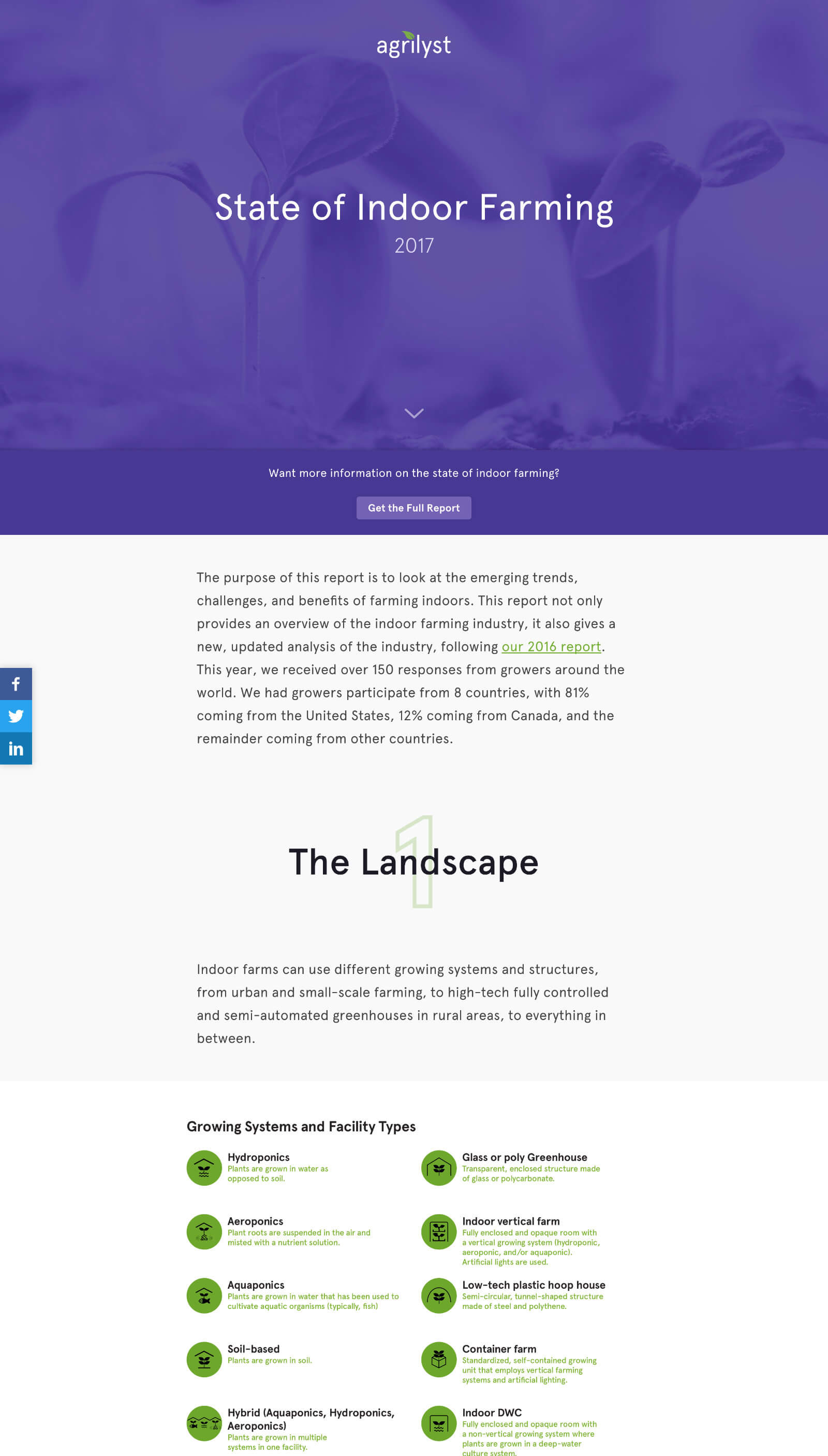
Every year, Agrilyst sends out a questionnaire to the entire controlled agriculture industry, and compiles the data into the State of Indoor Farming report. We release the report as both a microsite and a PDF, and I’m tasked with building both. This year, I also built the graphs and charts that present the data.
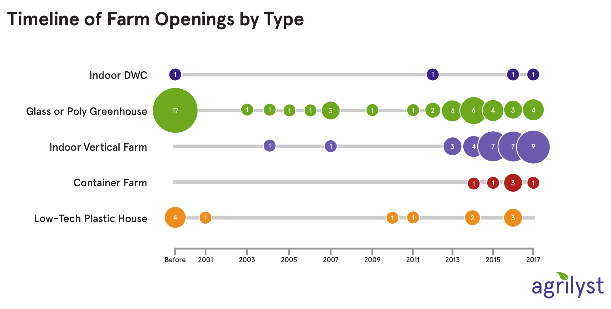
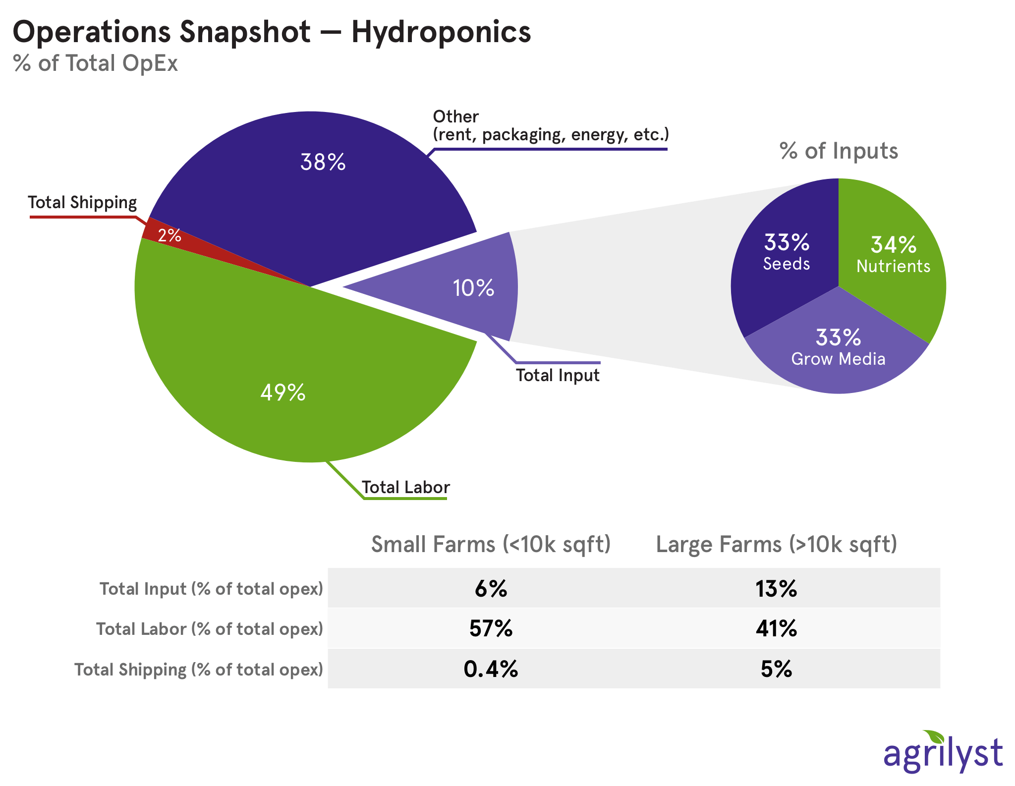
I built out a PDF template in InDesign, and a standalone webpage in HTML and CSS — wow, did it feel good to build something that didn’t need npm run or bundle install to get working. (Though to be fair, I did use gulp as a build system, so I’m not entirely yearning for the old days…)
The survey has spread far and wide, and the site has been seen throughout the Indoor Ag world.
Challenges, and the Future
Designing and building tools for farmers is a wonderful challenge. Indoor growers tend to be a more techy bunch than popular culture might have us believe, but our platform is still being used in greenhouses and vertical farms, where conditions tend to be different than those faced by your typical consumer app.
Watching the product grow has been thrilling. As we’ve expanded from the features that existed when I started to the features we have now, I’ve had to grow and adapt the design language to match. Similar to a toddler outgrowing his clothes every few months, the layouts and idioms that made sense when we started now feel limiting; it’s only by reevaluating and revising our interface that we’re able to prepare for the future of the platform.
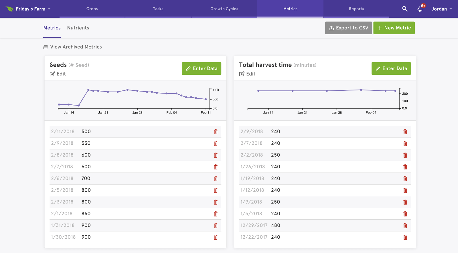
Agrilyst is an advanced product — it’s more Excel than Instagram. But “complex” doesn’t have to mean “complicated,” and our goal is always to make it simple and fast for farmers to get started.
Who says enterprise tools have to look and feel boring?