The Problem with Hill Charts
At Dwell, we use Hill Charts, a project management tool developed by the folks at Basecamp and built into Basecamp 3.
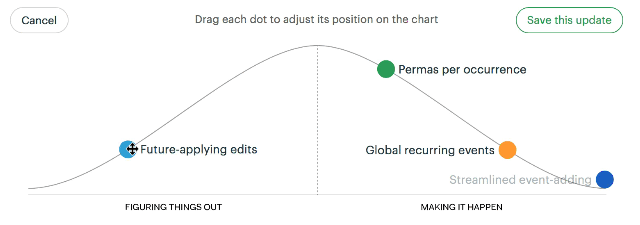
What are Hill Charts?
The basic premise is this:
To-do lists are imprecise (what does it mean for a project to be “42% done?”), so we need a visual representation of progress. A Hill Chart is a subjective visualization of progress in which each to-do is a dot positioned on a hill. The left side of the hill is for figuring out the unknowns of a project; the right side is for implementing the knowns.
The left/uphill side is for problem-solving, consideration, and figuring out uncertainty. The right side is for execution, implementation, and confidently taking care of the knowns.
Note: For more about Hill Charts beyond my oversimplified explanation, you can read Basecamp’s article, or watch this video from Ryan Singer (also embedded at the end of this post).
What’s Good About Hill Charts
I’ve found it helpful to have a visual representation of where we stand with different tasks, even (especially) if that representation is subjective. Hill Charts maintain a history, so you can scroll back and see the progress that’s been made in different places.
I haven’t done this, but I suspect that if I looked at the history of all of my tasks and projects, I’d see overconfidence at the beginning tapering off into realism as the dots get closer and closer to the end. Lots of progress in the “figuring things out” phase, followed by the realities of implementation bringing me back to earth.
What’s Bad About Hill Charts
Okay, now the part that was promised in the post title. There are some things I don’t like at all about Hill Charts, and while I don’t have a proposed solution, I thought I’d list them here in case somebody has some ideas:
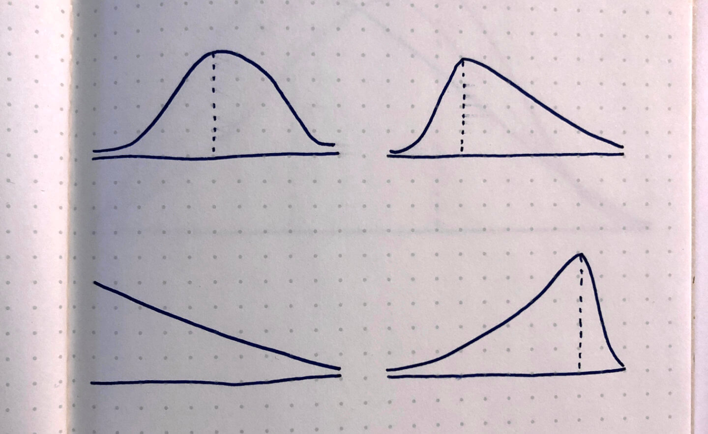
Equal horizontal movement ≠ equal work. Moving a dot 50px on the left side of the chart doesn’t necessarily equal moving a dot 50px on the right side of the chart. It’s possible to go up the entire left side of the hill in a day, but take weeks to go down the right side. The time it takes to figure out the implementation of a task isn’t necessarily the same as the time it takes to actually implement it.
A downward slope implies ease. The “Figuring Things Out” side of the chart moves uphill, making it look like a slog. The “Making it Happen” side goes downhill, making it look easy. “It’s all downhill from here.”
The difficulty slope of each project is different. Sometimes, the figuring-out process is more difficult than the implementation; other times, the implementation is harder than the figuring-out process. There’s no way to express this on a Hill Chart, since the slope is identical for every project.
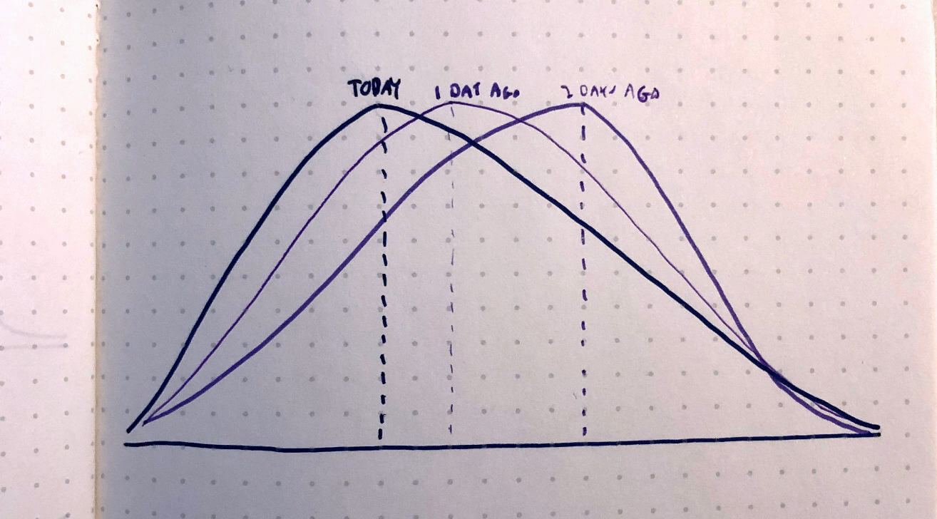
Progress gets more granular as time goes on. I’ve noticed this in my own usage of Hill Charts, so it could be just me. At the beginning of a task I tend to be overzealous in moving the dot from left to right. I’m pretty confident during the “figuring things out” process, but then once the implementation starts I move the dot smaller and smaller distances. The last portion of a task usually has a bunch of moves of a few pixels each. Maybe I’m just using Hill Charts wrong, or not breaking my work into tasks that are granular enough, but I suspect Hill Charts unintentionally incentivize this kind of usage.
Hill Charts are deliberately subjective, so perhaps this critique isn’t entirely fair. But since they’re specifically paired with to-do lists, I think they should be a more accurate reflection of the actual work it will take to move through a task.
How to Fix Hill Charts
We need a visual representation of progress through a task list. Hill Charts are a start, but I think we need a solution that incorporates some additional attributes:
Variable difficulty slopes. The user should be able to set the slope of the hill. Some projects might have a lengthy, shallow Figuring it Out segment; others might a steep, quick left side but a shallow, lengthy implementation side. Let the user decide.
Flexible difficulty slopes, with history. The initial slopes might be inaccurate, so users should be able to change it on-the-fly. These changes should be rolled into the Hill Chart history, so we could visualize how it’s changed over time.
I don’t know exactly what this solution would look like, but I’m hoping someone on the internet (or maybe Future Me) can help flesh this out into something real.
More About Hill Charts
Basecamp’s excellent Getting Real channel has two videos on Hill Charts as part of a larger series on how they work. Here’s the quick primer:
And here’s a more in-depth explanation with examples: