Redesigning the Dwell Audio Player for Usability, Beauty, and Accessibility
TL;DR — The Dwell player was getting cramped, so when the time came to add some new functionality, I redesigned it to be more usable and better organized.
This is the story of how the new player came to be.
The Context
Dwell is an audio Bible app for iPhone. Users People can listen to Scripture sequentially, or they can listen to topical playlists, key passages and stories, or daily listening plans. It’s more like Spotify than Audible: it fits the common usage pattern for the Bible, which is to experience it thematically as an anthology, rather than cover-to-cover as a linear book.
You can read my full case study on Dwell, including my involvement designing and building both the website and app, here.
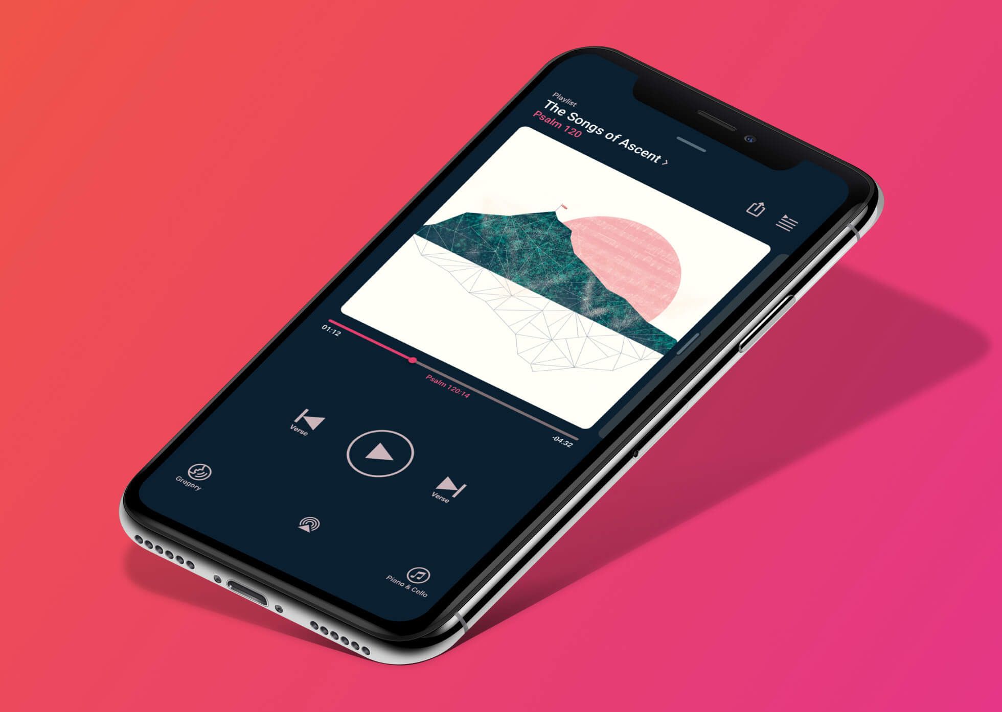
As with most audio apps, the centerpiece of the Dwell experience is the Player. It has the usual audio player accoutrement: a play/pause button, album art, a progress bar, the track name. It also has some Dwell-specific features, such as:
- Next/Previous buttons that jump by verse, rather than by track
- A button for changing the voice that’s currently reading
- A button for changing the background music
- Additional track info, including the type of content (playlist, listening plan, etc) and included verses
- The current verse being played, as part of the progress bar
- A button for changing the relative volume of the voices and music
It’s a lot to fit on one screen. Plus, from the beginning of my time at Dwell, we’ve known that we want to add more features to the player that will require additional space.
Adding the Queue
Towards the end of 2018, we decided to add a queue to Dwell. It does what you’d expect — users can add content to their queue, and then when the current track finishes playing it jumps to the next track in the queue. The user no longer has to select their next track manually every time the last one ends.
The queue has to be accessible from the player — that’s table stakes for an audio app, and I didn’t want to break an existing paradigm.
I started fiddling around with the player design, trying to figure out where the queue button could go, and quickly ran into a problem. I knew it made most sense at the top, for two reasons:
- That’s where the queue button most commonly goes in other audio apps. Again — don’t break an existing paradigm without a very good reason.
- I wanted the player and queue to flip back and forth, as if they were two sides of the same screen. The “Back to Player” button on the queue screen made the most sense in the top right, so in order to let users smoothly flip between the two, the “Go to Queue” button should also be in the top right, in the exact same position.
Unfortunately, the top right was already occupied by the Share button. And if I moved the Share button, something else would have to move, and then the dominoes would just keep falling.
Sounds like a good time to reconsider the player design.
Refreshing the Player
There are some things that are taken for granted in an audio player:
- The album art gets the prime real estate, occupying most of the center of the screen.
- There needs to be a progress bar.
- The playback controls should be centered and easily accessible, even when the user is distracted — while driving, for instance.
I didn’t want to mess with those givens, since Dwell’s mandate is to make the best audio Bible on the market, not to reinvent everything about an audio player. Ideally, the user should feel no friction switching between their favorite music player, their favorite podcast app, and Dwell.
I wound up with three objectives for the project:
- Add the Queue button, without making it feel cramped or forced.
- Create enough room that future additions won’t require a total redesign.
- Ideally, make the player feel even more simple and intuitive than it did before.
That third one was the stretch goal — I wasn’t sure we’d be able to make the player feel cleaner while adding more stuff.
Early Attempts
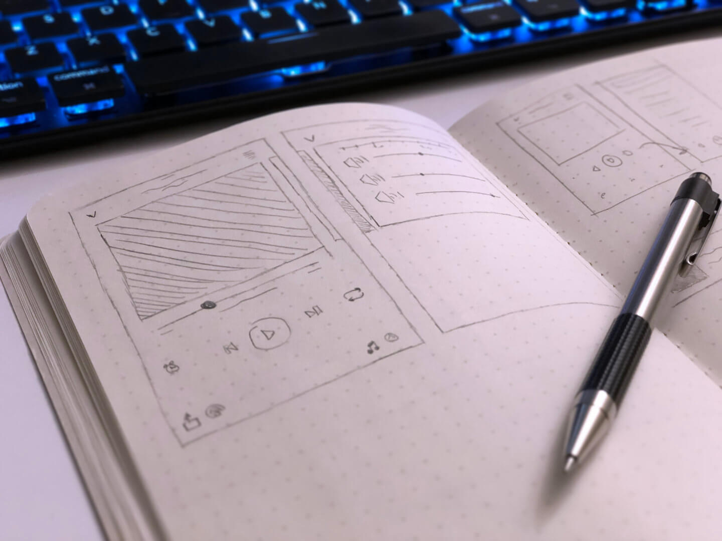
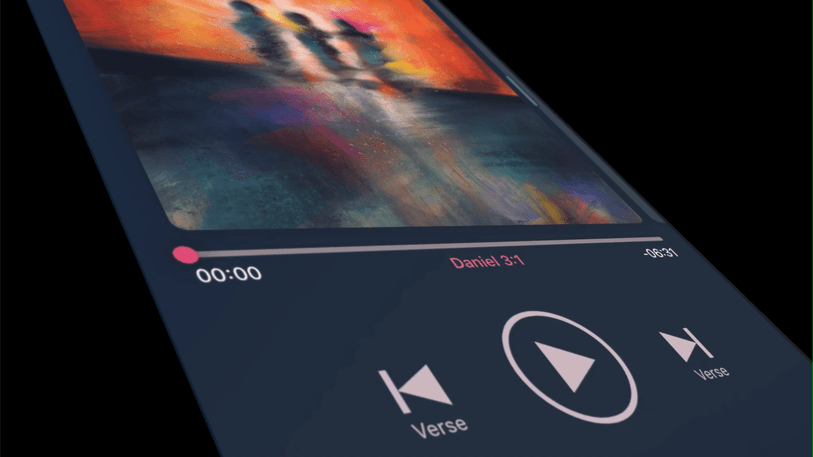
My first step was to sketch out the player in my notebook, along with a list of everything we needed to add. (I’m terrible at drawing with pen and paper; there’s a reason I jump to Sketch as soon as possible. If I can understand my drawing, it doesn’t matter that it doesn’t look cool and design-y, right?)
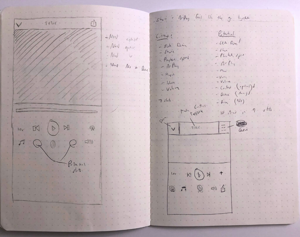
I then created a mockup based on that Sketch. This was a simple, brute-force attempt at making it work with more buttons — basically, just adding the new features to the existing layout. I knew from the start that this probably wasn’t going to work, but for the sake of completeness, I had to try it.
(You may notice there are some extra features in this mockup that aren’t in the final version, like the “Add to Queue” button. Turns out the use case for that is very limited, so I just got rid of it. Simple and usable is better than comprehensive and cluttered.)
This early mockup made it exceedingly obvious that this process would be easier if we could just move some of the features onto a separate screen. Some controls — like the playback rate and the volume — would maybe make sense under Settings, but I knew that many of our users liked having those handy right on the player.
Inspiration came in the form of another app. Several of us on the product team use Overcast as our podcast player of choice, and Overcast has a clever solution to a similar problem: it makes the cover art into a card, which can be swiped to reveal other cards with additional settings and information. I thought something similar could work with Dwell.
The Solution
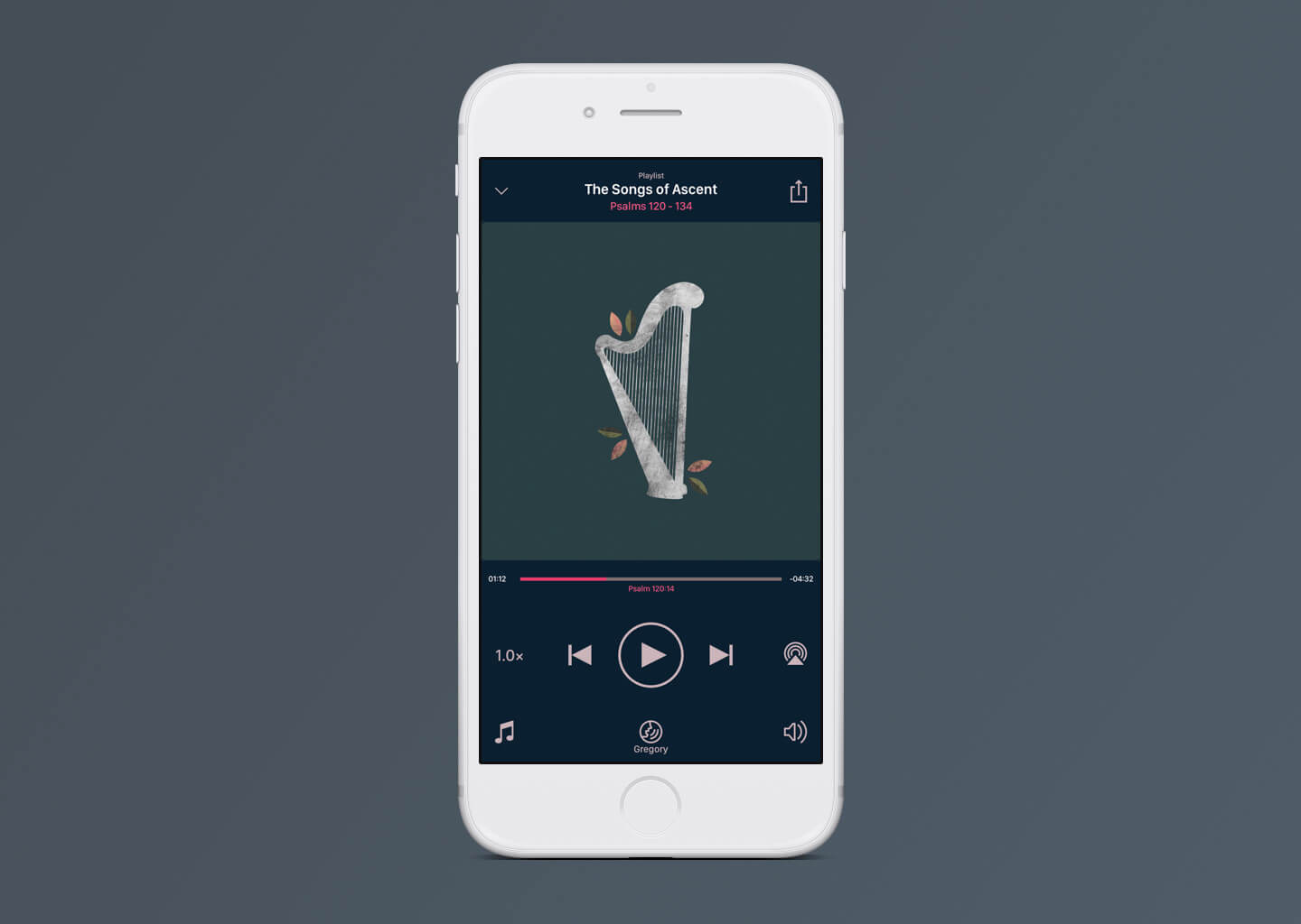
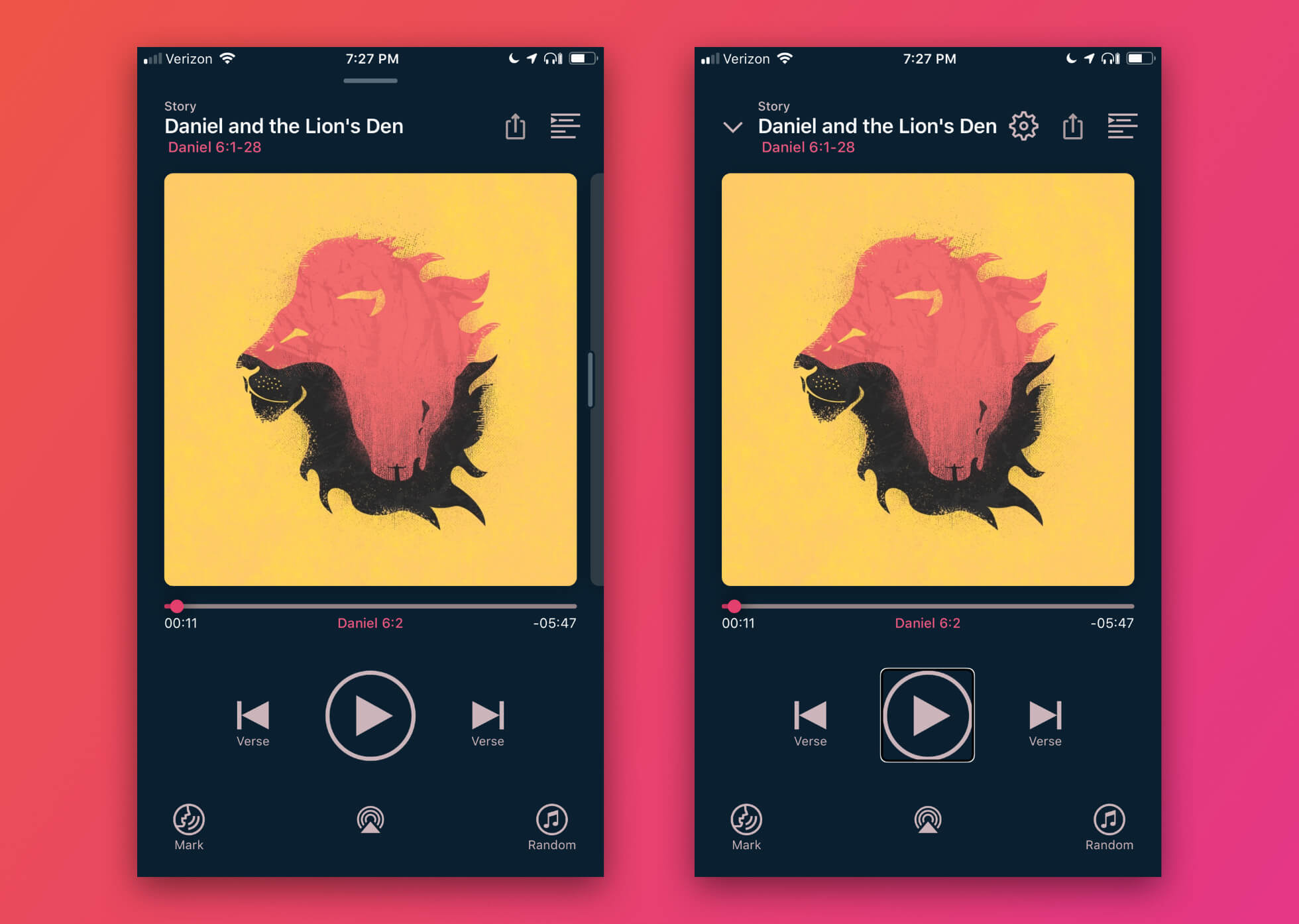
What we ended up with is a much simplified player screen, with power-user features available by swiping the cover to the left.
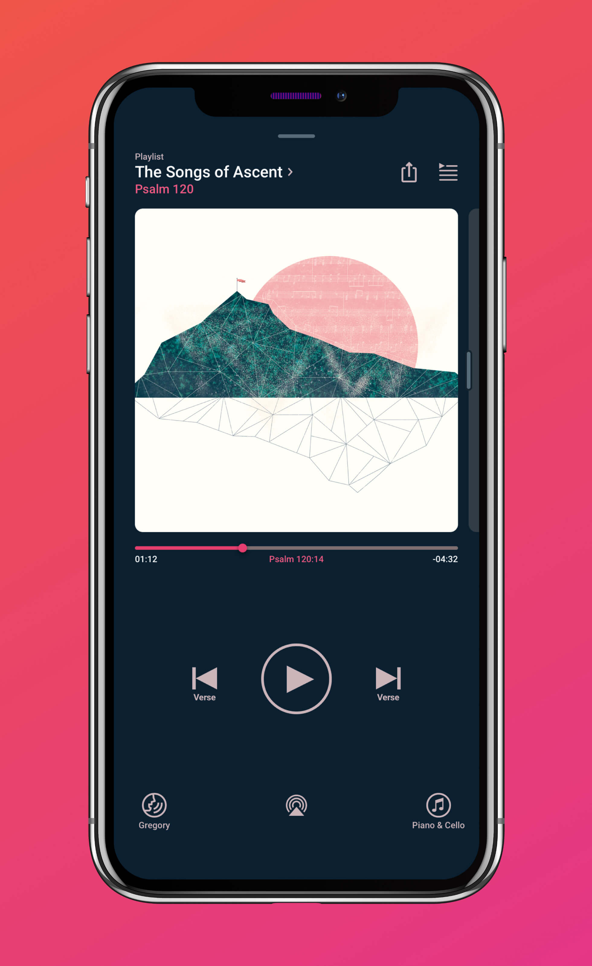
The new player moves the info text to the left, leaving more room in the top right for both the Queue button and the Share button. I removed the explicit Dismiss down arrow, but replaced it with a handle at the top of the screen to make it clear that the player can be dismissed by swiping it downwards.
The album art is now a card with curved edges, which has the added bonus of looking more contemporary than the previous full-bleed art.
I extended the progress bar to match the width of the album art, and moved the timestamps down below to align with the Current Verse text.
The Playback Rate and AirPlay buttons are gone from the middle of the screen, reserving that space for the playback controls. I also added some explanatory text beneath the previous/next buttons to make it clear that they’re for navigating verses, not tracks — a distinction that was previously only clear for users through trial-and-error.
The bottom corners of the screen now feature the Change Voice and Change Music buttons; since those buttons “rhyme” with each other, it makes sense to have them in similar spots. I inscribed the Change Music icon in a circle to make it match its counterpart, and the current album name is now displayed beneath the icon, similar to how the current narrator name is displayed underneath Change Voice.
I moved the AirPlay icon to the bottom center of the screen, slightly smaller than Change Voice and Change Music, to make it consistent with other audio apps.
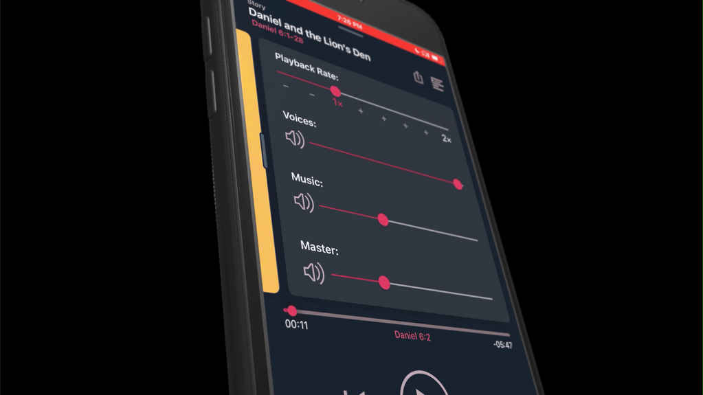
To make it clear that the album art is swipeable, a little sliver of the Settings card is always visible, along with a drag handle to make it extra clear. Swiping to the Settings card reveals some additional controls — the Playback Rate slider and the three Volume sliders, which were previously accessible via popovers.
Building the Player
One of the most rewarding things at Dwell has been the opportunity to learn Swift and experiment with native app development. I’m an experiential learner, and all my previous attempts at learning Swift have failed due to lack of a real project to work on. Being able to tinker with an actual production codebase has helped me grow by leaps-and-bounds in my understanding of the language (thanks, Jeff!)
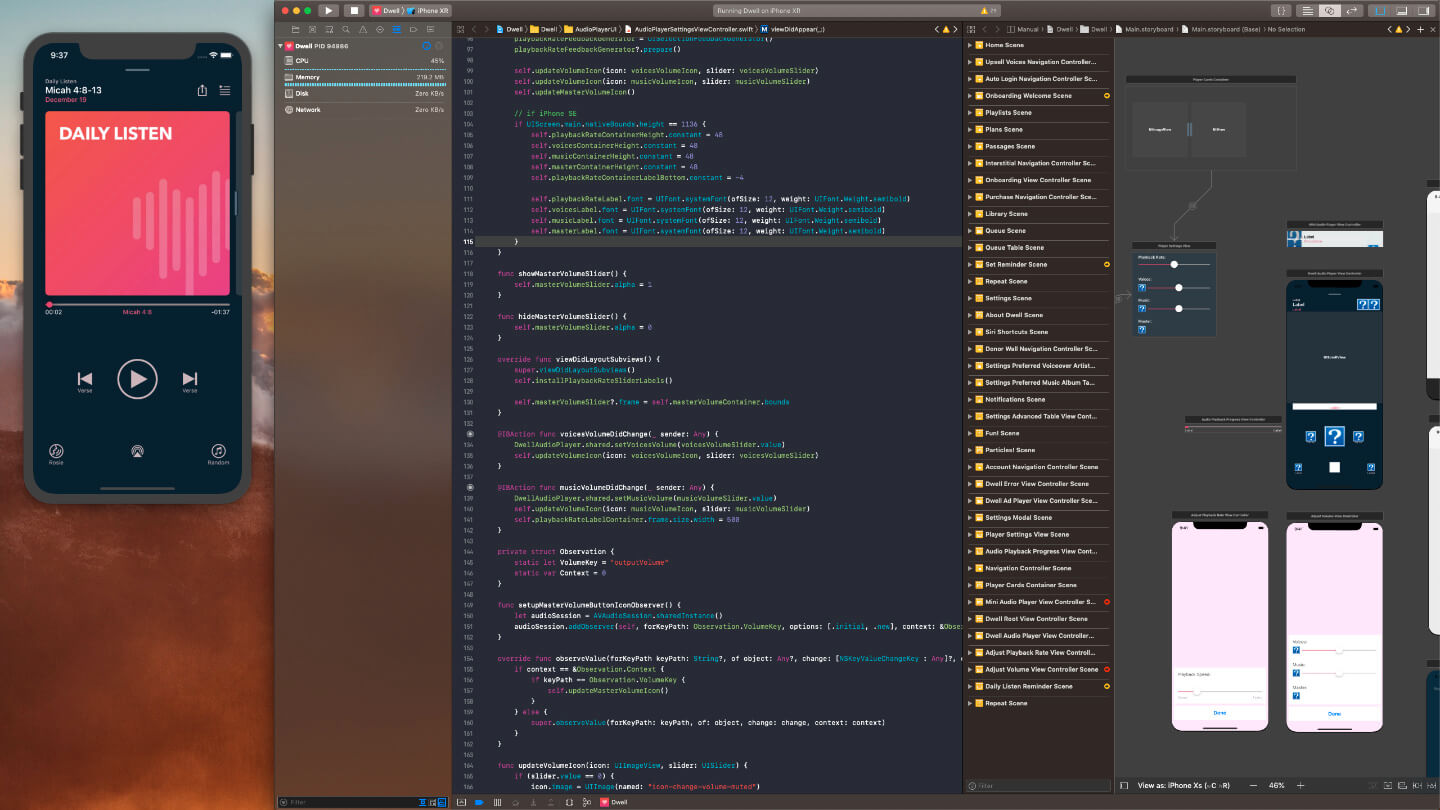
Since the changes to the Player were largely aesthetic, not functional, I volunteered to try implementing it myself. With the go-ahead, I rebuilt the existing player in Interface Builder (Xcode’s visual editor) and wired it up to the existing code in Swift. I reorganized the views to more closely match the design (and tried to name things with a sane naming scheme, a task that sounds much simpler than it actually is), and added Auto Layout constraints to make sure everything would scale nicely on any iPhone, from the tiny SE to the ginormous 8+ and X.
Implementing my own design also gave me the chance to play around with some of the subtler animations and micro-interactions. One example was the progress bar. In my original design, I hadn’t specified anything beyond the ability to drag the handle to change the user’s location in the track. When testing it on my phone, however, I realized that it would be much more satisfying to give the handle some animation when touched. Using Swift, I rewrote the slider to make the handle expand satisfyingly when the user presses it, and shrink back to normal when released.
Ensuring Accessibility
One of the foundations of Dwell is making sure it works beautifully for everyone. There are lots of Bible apps that have an audio feature, but for a user who’s blind, what good is it if the text looks great but the audio feature sounds like a robot? We’re dedicated to making Dwell a first-class experience for VoiceOver users and non-VoiceOver users alike.
Dwell’s VoiceOver support goes beyond just tagging elements with the appropriate text and making sure the tab order is logical. One thing I noticed while testing is that the player’s two swipe gestures didn’t translate well to screen readers: dismissing the player and accessing the Settings card just didn’t work for VoiceOver users.
To get around this, I set up the player to detect if the user has VoiceOver enabled. If they do, the layout shifts to introduce an explicit Dismiss button and a separate Settings button. Activating the Dismiss button dismisses the player (predictably), and activating the Settings button brings up a modal version of the Settings card. (The modal provides a better VoiceOver experience while tabbing through the controls than the swipeable cards).
Launching the Player
Even with extensive testing, there’s always a moment before releasing something new that I brace myself for the worst. The player is such a core part of the Dwell experience that messing it up could seriously damage our brand and reputation. What if I’d forgotten something?
Release day came and users started updating, and then — nothing. No negative feedback. The player was working well, most users just accepted it as the new normal, and we didn’t get any complaints that we ruined somebody’s favorite app.
To me, that’s victory — not that users would be blown away and shower us with praise, but that we make positive changes without interrupting anyone’s existing workflow. Good design should be invisible; it shouldn’t draw attention to itself, but should draw attention to the new abilities it gives the user.
In the week following the release, there was one piece of feedback we decided to take action on. Several users mentioned that they missed the playback rate controls — a feature that was still present, but hidden on the Settings card. Even with the drag handle and the card peeking out from the side of the screen, some users were still not realizing that there was a second card, so we made a quick correction. Now, the first few times a user opens the player, the cards give a little bounce to reveal that there are additional settings available with a swipe.
The new player has been in production for several months and accomplished each of its goals. The Queue button has a spot that makes sense; that player has enough open real estate that we can add several more buttons without needing a full redesign; and the screen is cleaner and more focused than it was previously.
Better yet, we’ve gotten App Store reviews that specifically mention our VoiceOver support as being excellent.
As of this writing, Dwell has 4.9 stars and 2,800+ ratings, and is in the top 100 in reference apps. Check it out in the App Store: Dwell Audio Bible